Storytelling with Data
Date
Jan 10, 2025 9:00 AM
Event
Guest Talk – Bioinformatics Study Club, ITS
Location
Smartclass, Biology Department, Institut Teknologi Sepuluh Nopember
Arif Rahman Hakim, Surabaya, East Java 60115
Watch the Talk
If you missed it, you can catch the full session here:
Or open it directly on YouTube.
Storytelling with Data
I was invited by the Bioinformatics study club at ITS to share some thoughts on a topic I love: Storytelling with Data.
It was a casual and fun session where we talked about:
- What makes a good data story?
- How to think visually (beyond just pretty charts)
- Some common mistakes scientists make when presenting data
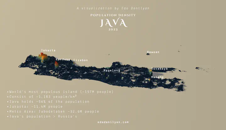
- Real examples of how I’ve used data viz in research and projects
We also got into some R-based workflows, including:
- Using
ggplot2for clean, flexible visuals - Telling temporal stories with animated plots with
gganimate - Making geospatial stories with
leafletandtmap - Tips on choosing the right chart for your message
A Few Key Takeaways
- Good data viz is about clarity, not decoration
- Always start with your audience in mind, what do they need to see?
- Use visual hierarchy and layout to guide attention
- Color, size, and motion can help (but only if used with purpose)
- Tidy data makes your life easier, learn the grammar of graphics!
It was great to see the enthusiasm and curiosity from everyone in the room. Thanks for having me!
If you’re curious about data viz, want to collaborate, or just want to nerd out about charts, hit me up anytime!