Spain Energy Generation Dashboard
Welcome!
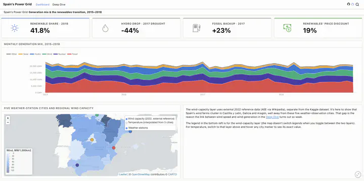
I came across this Kaggle dataset on Spain’s electricity generation and thought it would be fun to turn it into something a little more interactive. Instead of staring at rows of numbers, I wanted a way to explore how the country’s energy mix has changed over time and see how different energy sources compare.
The dashboard lets you browse the data at your own pace. You can look at long-term trends, compare renewable and non-renewable sources, also check the deepdive part, and hopefully spot a few interesting patterns along the way.
Have a look around and see what you find.
https://danilyanedo7.github.io/kaggle-energy/
Let’s Connect
Always happy to meet new people, swap ideas, talk science, design, data, or whatever else we find interesting.