R tutorial series: Choosing color for data visualization

When designing visualizations, choosing the right colors can greatly enhance readability, convey the correct message, and make your plots aesthetically pleasing. Here are some guidelines along with code examples to help you choose color palettes effectively.
Understand Your Data Type and Visualization Purpose
- Categorical Data: Use distinct colors to differentiate between groups or categories.
- Sequential Data: Use gradients where the intensity of color represents increasing or decreasing values.
- Diverging Data: Use palettes that emphasize a neutral midpoint, highlighting deviations from a central value.
Define a Core Palette for Consistency
Start with a set of main colors to create a consistent look across your visualizations.
main_colors <- c("#1696d2", "#d2d2d2", "#000000", "#fdbf11", "#ec008b", "#55b748", "#5c5859", "#db2b27")Here is what that palette actually looks like:
Use Shades to Represent Variations
Shades of a main color can be used for gradients or to show hierarchy. For example:
shades_blue <- c("#cfe8f3", "#a2d4ec", "#73bfe2", "#46abdb", "#1696d2", "#12719e", "#0a4c6a", "#062635")
shades_grey <- c("#f5f5f5", "#ececec", "#e3e3e3", "#dcdbdb", "#d2d2d2", "#9d9d9d", "#696969", "#353535")
Blue sequence
Grey sequence
These can be especially useful for continuous scales or when you need subtle color transitions.
Tailor Palettes to the Number of Groups
Depending on the number of groups in your data, choose or create a palette that provides enough distinction:
- One Group:
one_group <- c("#1696d2", "#000000")- Two Groups:
  categorical_two <- c("#1696d2", "#000000", "#d2d2d2", "#fdbf11")
  political_two <- c("#1696d2", "#db2b27")
sequential_two <- c("#a2d4ec", "#1696d2")- Three Groups:
  categorical_three <- c("#1696d2", "#000000", "#d2d2d2", "#fdbf11", "#55b748", "#ec008b")
sequential_three <- c("#a2d4ec", "#1696d2", "#0a4c6a")- Four, Five, Six, Seven Groups:
You can expand the palette as needed:
  categorical_four <- c("#1696d2", "#000000", "#d2d2d2", "#fdbf11", "#ec008b")
  sequential_four <- c("#cfe8f3", "#73bfe2", "#1696d2", "#0a4c6a")

  categorical_five <- c("#1696d2", "#000000", "#d2d2d2", "#fdbf11", "#ec008b", "#0a4c6a", "#55b748")
  sequential_five <- c("#cfe8f3", "#73bfe2", "#1696d2", "#0a4c6a", "#000000")

  categorical_six <- c("#1696d2", "#000000", "#d2d2d2", "#fdbf11", "#55b748", "#ec008b", "#0a4c6a")
  sequential_six <- c("#cfe8f3", "#a2d4ec", "#73bfe2", "#46abdb", "#1696d2", "#12719e")

  categorical_seven <- c("#1696d2", "#000000", "#d2d2d2", "#fdbf11", "#55b748", "#ec008b", "#0a4c6a")
  sequential_seven <- c("#cfe8f3", "#a2d4ec", "#73bfe2", "#46abdb", "#1696d2", "#12719e", "#0a4c6a")
Use Diverging Palettes for Midpoint-Based Data
When you need to highlight how values diverge from a central point, a diverging palette is ideal.
diverging_colors <- c("#ca5800", "#fdbf11", "#fdd870", "#fff2cf", "#cfe8f3", "#73bfe2", "#1696d2", "#0a4c6a")Practical Examples with ggplot2
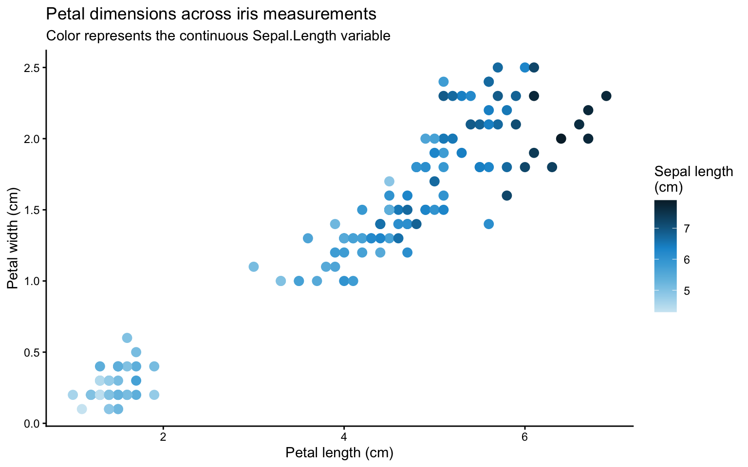
Scatter Plot with a Sequential Palette
library(tidyverse)
ggplot(iris, aes(
  x = Petal.Length,
  y = Petal.Width,
  color = Sepal.Length
)) +
  geom_point(size = 3) +
  scale_color_gradientn(colors = shades_blue) +
  theme_classic() +
  labs(
    title = "Petal dimensions across iris measurements",
    subtitle = "Color represents the continuous Sepal.Length variable",
    x = "Petal length (cm)",
    y = "Petal width (cm)",
    color = "Sepal length\n(cm)"
  )
Bar Chart with a Categorical Palette
ggplot(mpg, aes(x = class, fill = class)) +
  geom_bar() +
  scale_fill_manual(values = categorical_seven) +
  theme_classic() +
  labs(title = "Count of Cars by Class",
       subtitle = "Using categorical_seven palette",
       fill = "Car Class")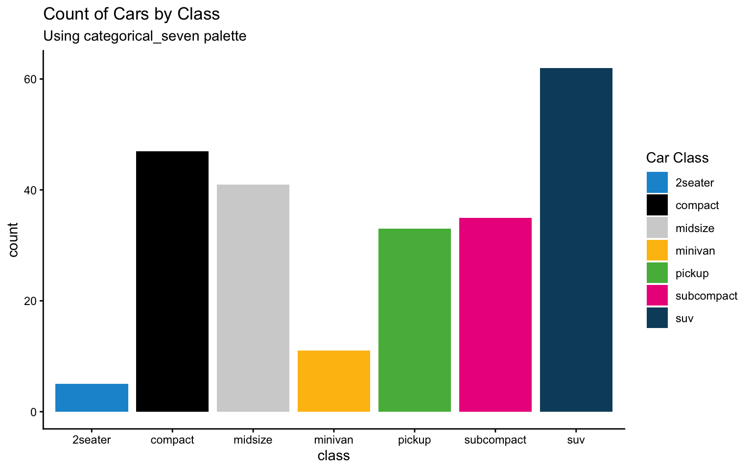
Continuous Gradient for Price vs. Carat
ggplot(diamonds, aes(x = carat, y = price, color = carat)) +
  geom_point(alpha = 0.6) +
  scale_color_gradientn(colors = shades_blue) +
  theme_classic() +
  labs(title = "Diamonds: Price vs. Carat",
       subtitle = "Using shades_blue as a continuous gradient",
       color = "Carat")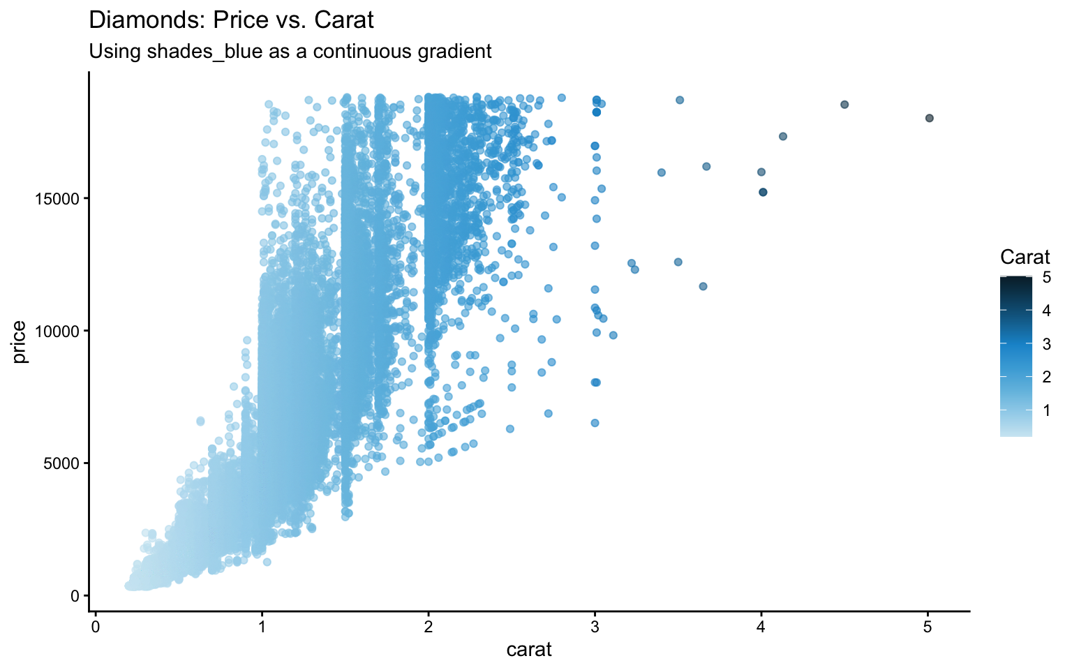
Boxplot with Custom Shades
# Identify the unique drive types in mpg
drv_levels <- sort(unique(mpg$drv))
# Select three shades from shades_grey (for example, positions 2, 4, and 6)
selected_grey <- shades_grey[c(2, 4, 6)]

ggplot(mpg, aes(x = drv, y = hwy, fill = drv)) +
  geom_boxplot() +
  scale_fill_manual(values = selected_grey) +
  theme_classic() +
  labs(title = "Highway MPG by Drive Type",
       subtitle = "Using custom shades from shades_grey",
       fill = "Drive Type")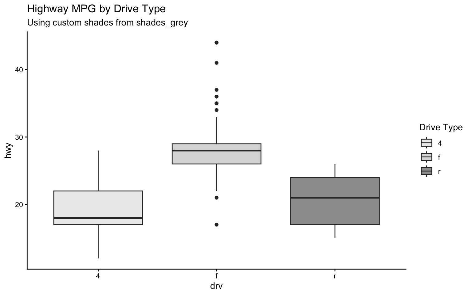
Binary Category Bar Chart
mtcars2 <- mtcars %>%
  mutate(gear_binary = ifelse(gear == 4, "Four Gears", "Other Gears"))

ggplot(mtcars2, aes(x = gear_binary, fill = gear_binary)) +
  geom_bar() +
  scale_fill_manual(values = categorical_two) +
  theme_classic() +
  labs(title = "Count of Cars by Gear (Binary)",
       fill = "Gear Category")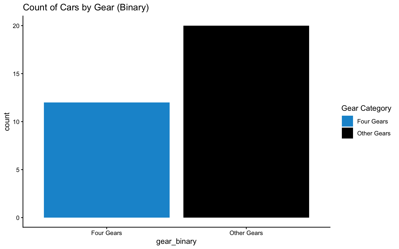
2D Density Plot with Diverging Palette
ggplot(iris, aes(x = Petal.Length, y = Petal.Width, fill = after_stat(density))) +
  stat_density_2d(geom = "raster", contour = FALSE) +
  scale_fill_gradientn(colors = diverging_colors) +
  theme_classic() +
  labs(title = "2D Density of Iris Petal Dimensions",
       fill = "Density")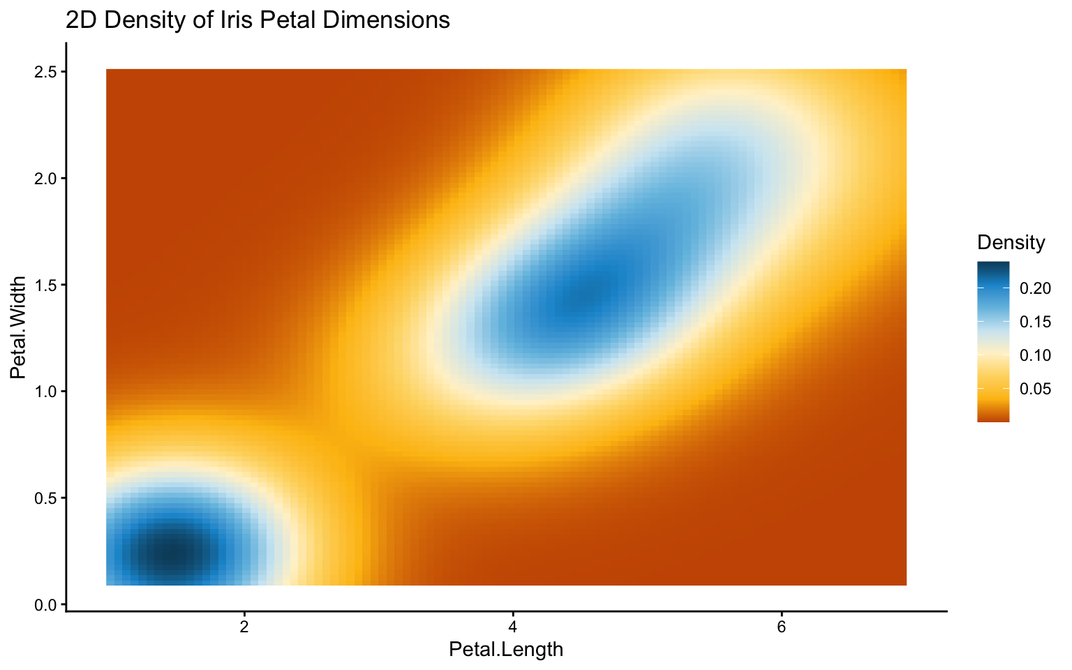
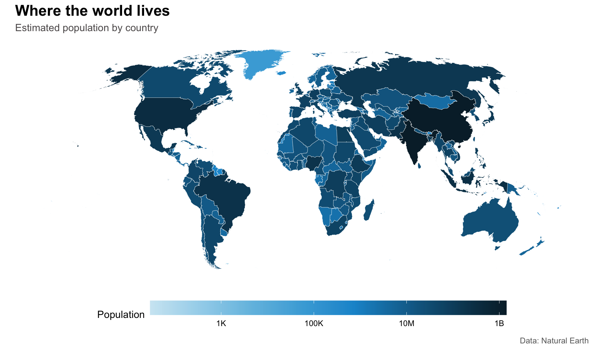
A Fancier Example: World Population Map
A map is a good test for a sequential palette because the reader should immediately understand that darker color means “more.” This example uses Natural Earth country boundaries, a logarithmic population scale, and a Robinson projection. The classic theme keeps the typography and legend clean while theme() removes the axes, which are usually unnecessary for a world map.
library(ggplot2)
library(sf)
library(rnaturalearth)
library(scales)

shades_blue <- c(
  "#cfe8f3", "#a2d4ec", "#73bfe2", "#46abdb",
  "#1696d2", "#12719e", "#0a4c6a", "#062635"
)

world <- ne_countries(scale = "medium", returnclass = "sf")
world <- world[world$admin != "Antarctica", ]
world$pop_est[world$pop_est <= 0] <- NA

ggplot(world) +
  geom_sf(
    aes(fill = pop_est),
    color = "white",
    linewidth = 0.12
  ) +
  coord_sf(crs = "+proj=robin", datum = NA) +
  scale_fill_gradientn(
    colors = shades_blue,
    trans = "log10",
    labels = label_number(scale_cut = cut_short_scale()),
    na.value = "#ececec",
    name = "Population"
  ) +
  labs(
    title = "Where the world lives",
    subtitle = "Estimated population by country",
    caption = "Data: Natural Earth"
  ) +
  theme_classic(base_size = 12) +
  theme(
    axis.line = element_blank(),
    axis.text = element_blank(),
    axis.ticks = element_blank(),
    axis.title = element_blank(),
    legend.position = "bottom",
    legend.key.width = grid::unit(3, "cm"),
    plot.title = element_text(face = "bold", size = 18),
    plot.subtitle = element_text(color = "#5c5859"),
    plot.caption = element_text(color = "#696969")
  )
Popular Color Palette
library(RColorBrewer)
display.brewer.all()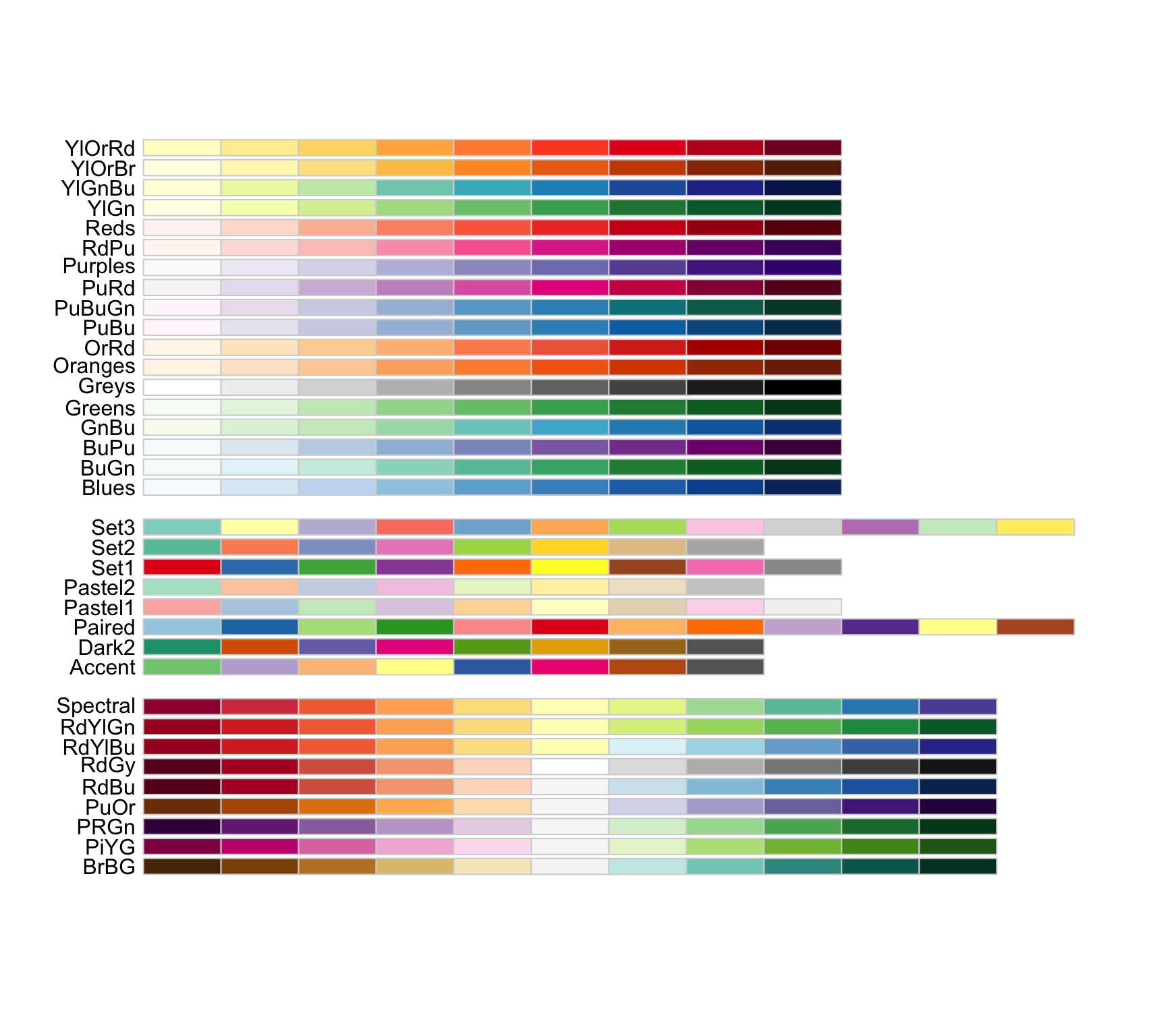
Additional Tips
- Contrast & Accessibility: Ensure sufficient contrast between colors to maintain readability for all users.
- Consistency: Apply similar color schemes across multiple charts to help viewers quickly associate colors with data groups.
- Test in Context: Always preview your palette with actual data. Adjust as necessary to ensure the intended message is conveyed.
- Cultural Considerations: Be mindful of color connotations (e.g., red may imply warning or danger in many cultures).