R tutorial series: Analyzing bacterial growth from OD600 data
Bacterial growth analysis is a fundamental task in microbiology, allowing researchers to monitor the proliferation of bacteria over time. Optical Density at 600 nm (OD600) is a commonly used method to measure this growth. Growth-curve analysis is a useful starting point for biology students learning quantitative microbiology. By the end, you’ll have a small, reusable R workflow instead of a one-off spreadsheet calculation.
What you’ll learn
By the end of this tutorial, you’ll be able to:
- Load a raw OD600 CSV export and tidy it into one row per sample/timepoint.
- Plot growth curves for several samples at once, on both a raw and log scale.
- Automatically detect each sample’s exponential phase with a sliding-window regression, instead of eyeballing where it starts and ends.
- Estimate each sample’s maximum specific growth rate (μmax) and doubling time, and compare them across samples.
Before you start
You’ll need:
- R and RStudio installed on your machine.
- Basic familiarity with
dplyr/ggplot2syntax (pipes,mutate(),ggplot()+ geoms). This tutorial assumes some familiarity with those concepts and focuses on the biology- and growth-curve-specific steps. - Your own OD600 readings, or the example dataset here (personal data collected during my training at the University of Vienna, using Vibrio as a bacterial model grown in marine broth liquid medium) to follow along.
Libraries we need
First, let’s install and load the packages this analysis depends on.
libs <- c(
  "readr", "dplyr", "tidyr", "purrr", "lubridate",
  "ggplot2", "ggsci", "plotly", "knitr")

installed_libs <- libs %in% rownames(installed.packages())
if (any(installed_libs == FALSE)) {
  install.packages(libs[!installed_libs])
}

invisible(lapply(libs, library, character.only = TRUE))
Running that chunk installs anything missing and loads it all: readr for reading the CSV, dplyr/tidyr/purrr for wrangling, lubridate for parsing the time stamps, ggplot2/ggsci for static plots, plotly for an interactive version, and knitr for printing tidy summary tables. You only need to do this once per R session.
Load and tidy the data
Next, we’ll read in the raw OD600 readings and reshape them into one tidy row per sample/timepoint: the format every plot and calculation later in this tutorial expects. If you’re using your own data, export it as a CSV (Excel works too, just keep the same column layout) with the same two columns described below.
The raw file has one row per reading, with a Sample_name column encoding both the sample and the time it was taken (e.g. WT_09:15), plus the raw Result (OD600 reading). The workflow below supports any number of samples. Nothing has to change if you add more.
blank_od <- 0.001 # OD600 of your blank/media-only well, adjust to your own measurement

df <- read_csv("od_data2.csv") %>%
  mutate(
    Sample = sub("_.*", "", Sample_name),
    Time   = sub(".*_", "", Sample_name),
    Time   = hm(Time),
    Result = Result - blank_od) %>%
  filter(Result > 0) %>% # can't take log() of a non-positive OD
  mutate(Result_log = log(Result)) %>%
  group_by(Sample) %>%
  arrange(Time, .by_group = TRUE) %>%
  mutate(Time_h = as.numeric(Time - min(Time), units = "hours")) %>%
  ungroup() %>%
  select(Sample, Time_h, Result, Result_log)

glimpse(df)
## Rows: 34
## Columns: 4
## $ Sample <chr> "t1.1", "t1.1", "t1.1", "t1.1", "t1.1", "t1.1", "t1.1", "t1…
## $ Time_h <dbl> 12.51667, 13.70000, 13.96667, 14.23333, 14.45000, 14.73333,…
## $ Result <dbl> 0.001, 0.005, 0.008, 0.014, 0.019, 0.032, 0.049, 0.078, 0.0…
## $ Result_log <dbl> -6.907755, -5.298317, -4.828314, -4.268698, -3.963316, -3.4…glimpse(df) should show one row per sample/timepoint with four columns: Sample, Time_h, Result, and Result_log. A few changes from a “just read the CSV” approach worth calling out:
- The blank correction lives in a named
blank_odvariable instead of a magic number buried in a pipe, so it’s obvious what to change for your own plate reader. - Any blank-corrected reading
<= 0is dropped before log-transforming. Otherwiselog()silently returns-Inf/NaNand breaks the regressions further down. Timeis converted to hours elapsed since that sample’s first reading (Time_h), computed per sample. That keeps the x-axis in intuitive units and means samples that were started at different clock times still line up at t = 0.
With df tidy, every plot and calculation from here on can just reference Sample, Time_h, and Result/Result_log. No more parsing needed.
Growth curves for all samples
Now that the data is tidy, let’s plot every sample’s growth curve on one panel so we can see all of them at a glance.
p_raw <- ggplot(df, aes(x = Time_h, y = Result, color = Sample)) +
  geom_line() +
  geom_point(size = 1) +
  labs(
    title = "Optical Density λ600",
    x = "Time (hours)",
    y = "Optical Density (OD600)") +
  scale_color_nejm() +
  theme_minimal()

p_raw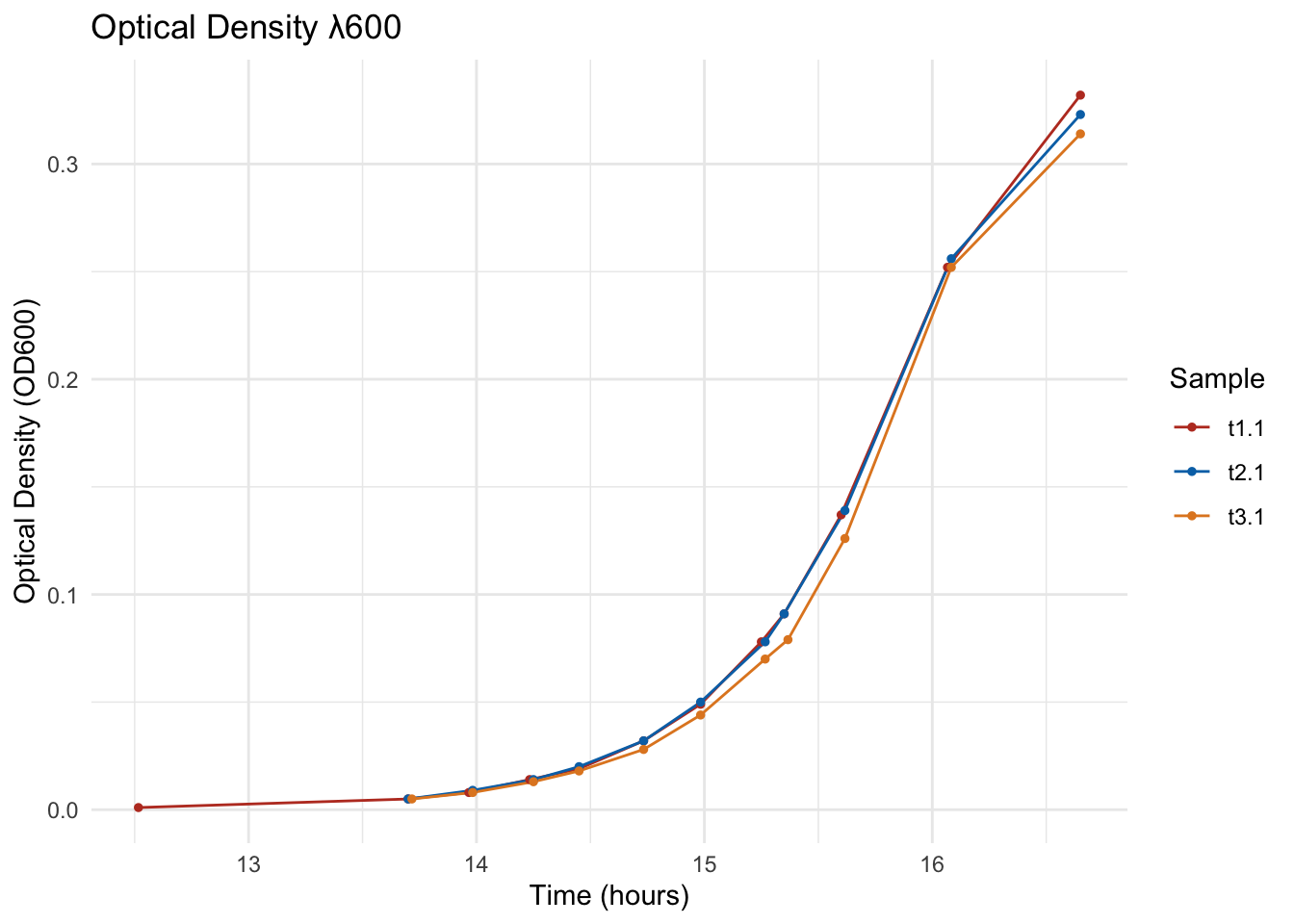
You should now see a classic growth curve per sample: a flat lag phase, a rising exponential phase, and a plateau once the culture saturates. That exponential stretch is what we actually want to quantify, but it’s hard to pinpoint precisely on this raw scale, which is where the next plot helps.
Log-transformed OD600
Let’s re-plot the same data on a log scale, which is what makes the exponential phase visible as a straight line, that straight segment is exactly what the next section detects automatically.
p_log <- ggplot(df, aes(x = Time_h, y = Result_log, color = Sample)) +
  geom_line() +
  geom_point(size = 1) +
  labs(
    title = "Optical Density λ600 (log scale)",
    x = "Time (hours)",
    y = "log(Optical Density)") +
  scale_color_nejm() +
  theme_minimal()

p_log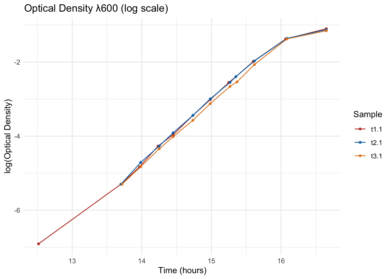
Notice how each sample’s curve now has a straight-line segment somewhere in the middle, that’s its exponential phase. The slope of that segment is what we’ll estimate next.
Finding μmax with a sliding-window regression
In batch culture, growth during the exponential phase follows
\[ \frac{dN}{dt} = \mu N \]
so a straight line fit to log(N) vs. time has slope μ, the specific growth rate. μmax is the highest μ sustained anywhere in the curve, i.e. the steepest straight stretch of the log-transformed curve.
Rather than eyeballing where the exponential phase starts and ends (as I did in an earlier version of this post, and which has to be re-guessed by hand for every new sample), we slide a small window of consecutive time points along each sample’s curve, fit a linear regression of Result_log ~ Time_h inside every window, and keep the window with the steepest good-quality fit. This is the same idea used by dedicated growth-curve tools like the growthcurver package.
find_mu_max <- function(data, window = 5) {
  data <- arrange(data, Time_h)
  n <- nrow(data)
  if (n < window) {
    return(tibble())
  }

  map_dfr(1:(n - window + 1), function(i) {
    w <- data[i:(i + window - 1), ]
    fit <- lm(Result_log ~ Time_h, data = w)
    tibble(
      window_start = min(w$Time_h),
      window_end   = max(w$Time_h),
      mu           = unname(coef(fit)[2]),
      r_squared    = summary(fit)$r.squared
    )
  })
}
window is the number of consecutive readings used per regression. Tune it to your sampling frequency (e.g. a smaller window for coarser sampling, a larger one for very frequent readings) so each window still spans a few minutes of real growth.
We apply this per sample, then for each sample keep the best window: the steepest slope among windows with a good linear fit (r_squared > 0.98).
growth_windows <- df %>%
  group_by(Sample) %>%
  group_modify(~ find_mu_max(.x, window = 5)) %>%
  ungroup()

mu_max_summary <- growth_windows %>%
  filter(r_squared > 0.98, mu > 0) %>%
  group_by(Sample) %>%
  slice_max(mu, n = 1, with_ties = FALSE) %>%
  ungroup() %>%
  mutate(doubling_time_min = (log(2) / mu) * 60) %>%
  select(Sample, mu_max = mu, r_squared, window_start, window_end, doubling_time_min)

kable(mu_max_summary, digits = 3,
      col.names = c("Sample", "μmax (h⁻¹)", "R²",
"Window start (h)", "Window end (h)", "Doubling time (min)"))| Sample | μmax (h⁻¹) | R² | Window start (h) | Window end (h) | Doubling time (min) |
|---|---|---|---|---|---|
| t1.1 | 1.797 | 0.998 | 13.700 | 14.733 | 23.140 |
| t2.1 | 1.782 | 0.998 | 13.700 | 14.733 | 23.332 |
| t3.1 | 1.703 | 0.999 | 13.717 | 14.733 | 24.420 |
You now have one row per sample with its μmax, the R² of the fit that produced it, the time window it came from, and the doubling time that follows directly from μmax:
\[ t_d = \frac{\ln(2)}{\mu_{max}} \]
That’s the core result of this tutorial, but a number is only as trustworthy as the window it came from, so let’s double-check it visually before using it.
Checking the detected exponential phase
Before trusting these numbers, it’s worth visualizing which window was picked for each sample, overlaid on the log-transformed curve.
ggplot(df, aes(x = Time_h, y = Result_log)) +
  geom_rect(
    data = mu_max_summary,
    aes(xmin = window_start, xmax = window_end, ymin = -Inf, ymax = Inf),
    inherit.aes = FALSE, fill = "grey80", alpha = 0.5
  ) +
  geom_line(aes(color = Sample), show.legend = FALSE) +
  geom_point(aes(color = Sample), size = 1, show.legend = FALSE) +
  facet_wrap(~Sample, scales = "free_x") +
  labs(
    title = "Detected exponential-phase window per sample",
    x = "Time (hours)", y = "log(Optical Density)") +
  scale_color_nejm() +
  theme_minimal()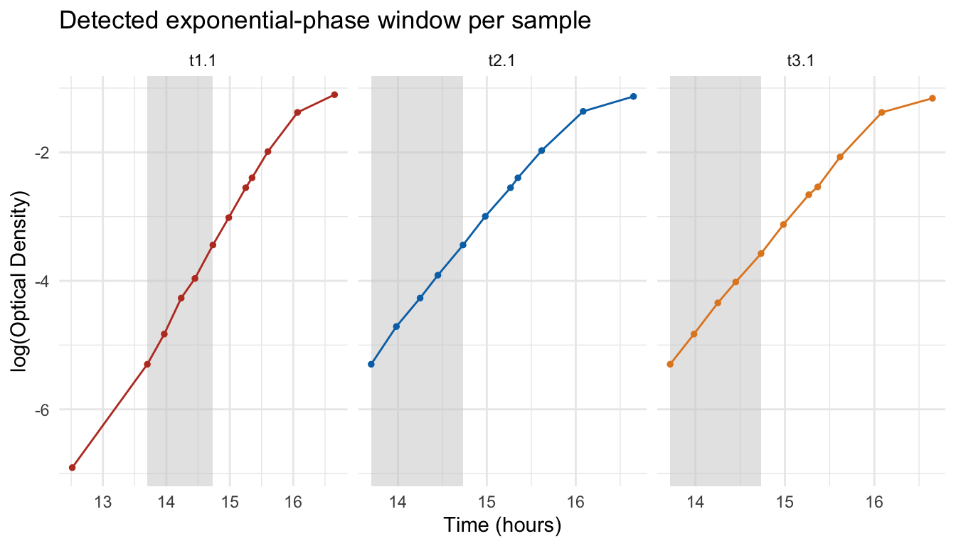
The shaded rectangle is the window find_mu_max() selected for that sample. If it looks too short, too noisy, or off to one side, adjust the window size or the r_squared cutoff above and re-run. Once the shaded windows line up with what you’d have picked by eye, you can trust the mu_max_summary table.
Comparing growth rate across samples
This is the part that’s easy to lose track of when analyzing one sample at a time: how do the samples actually compare? Let’s turn the summary table into a chart.
mu_max_summary %>%
  select(Sample, `μmax (h⁻¹)` = mu_max, `Doubling time (min)` = doubling_time_min) %>%
  pivot_longer(-Sample, names_to = "metric", values_to = "value") %>%
  ggplot(aes(x = reorder(Sample, value), y = value, fill = Sample)) +
  geom_col(show.legend = FALSE) +
  facet_wrap(~metric, scales = "free_x") +
  coord_flip() +
  scale_fill_nejm() +
  labs(x = NULL, y = NULL, title = "Growth rate vs. doubling time by sample") +
  theme_minimal()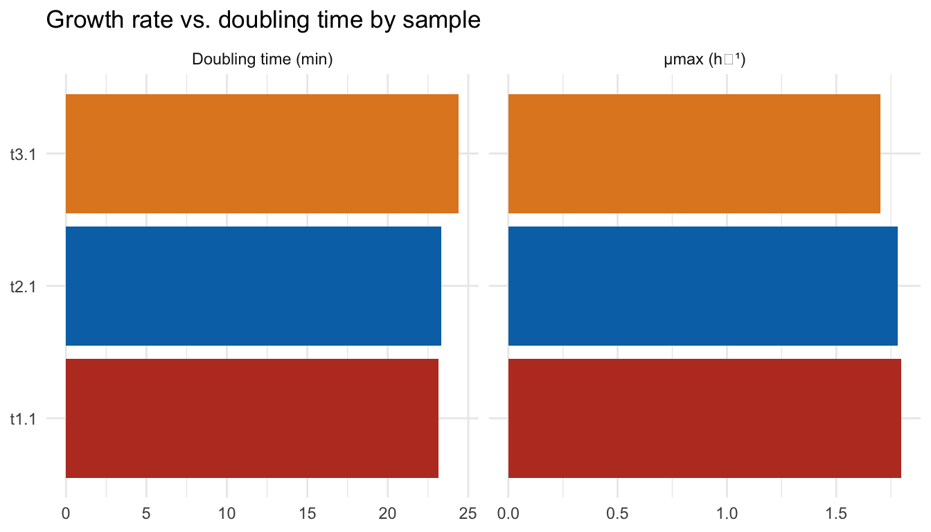
With that, the two side-by-side panels give you a fast ranking of which sample grew fastest (μmax) and which grew slowest to double (doubling time), the two views agree by construction, but seeing both side by side makes outliers obvious.
Interactive growth curve
Finally, it’s handy to have an interactive version of the raw growth curve for zooming into a specific stretch or checking individual points.
ggplotly(p_raw)Hover over any point to read its exact Sample, Time_h, and Result useful for sanity-checking a suspicious reading without going back to the raw CSV.
What you built
You now have a small, reusable R workflow that takes a raw OD600 CSV and turns it into growth curves, an automatically-detected exponential phase, and a μmax/doubling-time table per sample for any number of samples, without hand-tuning a lag_end/exp_end cutoff for each one. Because every plot and number above is regenerated straight from the CSV when this document is knitted, re-running the whole analysis on a new plate is just a matter of swapping the input file.
Next steps
From here, a few things worth trying on your own:
- Swap in your own OD600 CSV (same two-column layout) and re-knit, that’s the real test of whether this workflow generalizes beyond the example data.
- Tune the
windowsize andr_squaredcutoff infind_mu_max()for your own sampling frequency, and watch how the detected windows in the “Checking the detected exponential phase” plot shift. - Compare your μmax estimates against a dedicated tool like the
growthcurverpackage, which fits a full logistic growth model instead of a sliding-window regression.
This is the first post in an R-for-biologists serie, I will see you in the next one.
See you in the next post and have a beautiful day!