Data Analysis and Visualization Portfolio
Communicating science using visual
 Scroll down for hi res images
Table of Contents
Overview
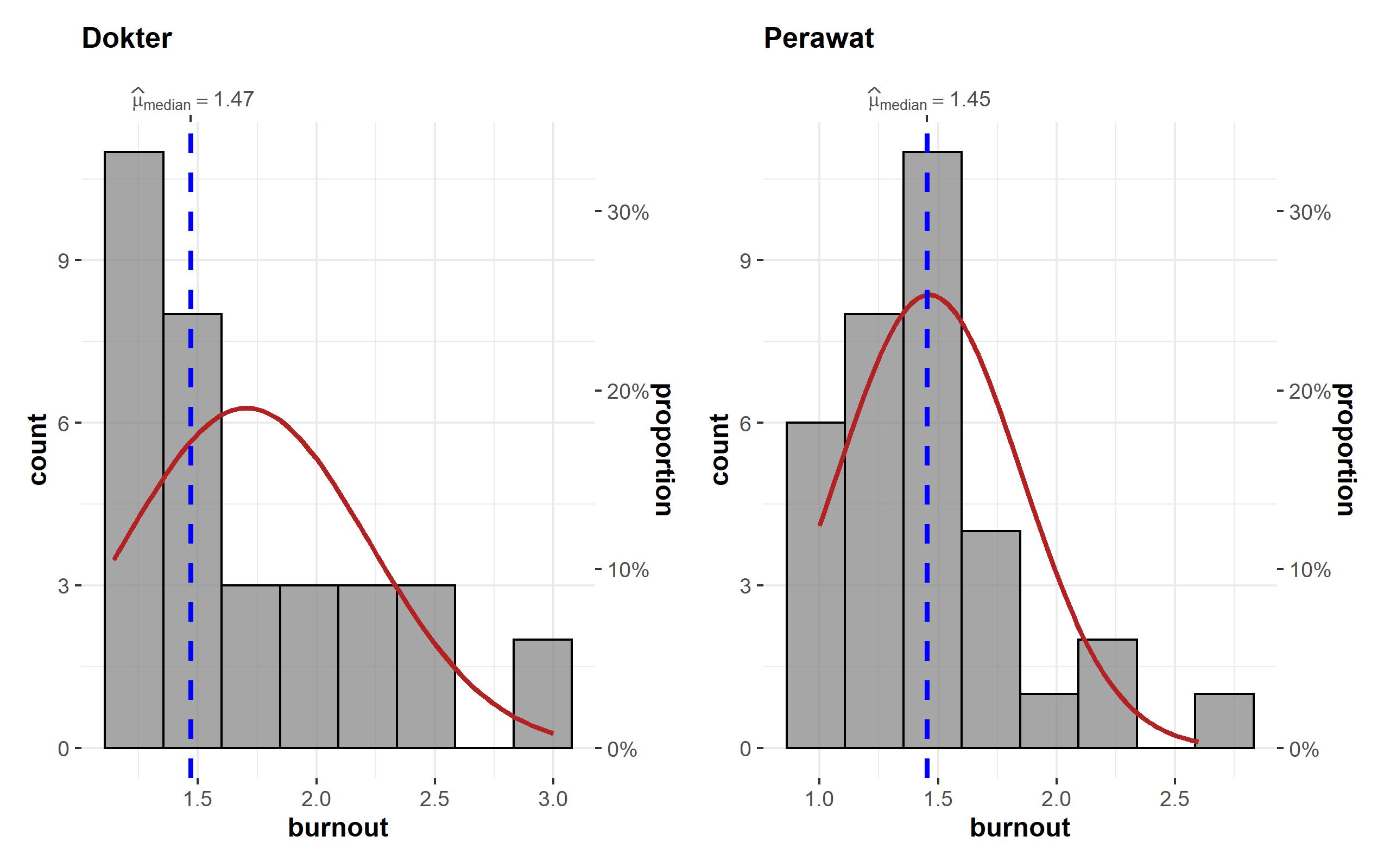
I primarily use RStudio for exploratory data analysis, visualization, and statistical modeling. My toolkit includes ggplot2, plotly, ggstatsplot, and a range of geospatial and statistical packages.
I’ve applied these tools to diverse projects—from time series and geospatial mapping to statistical inference and bioinformatics pipelines. These experiences have sharpened my ability to turn complex datasets into clear, compelling visual narratives.
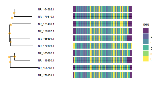
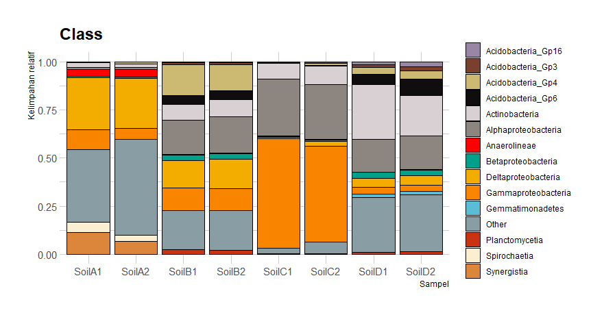
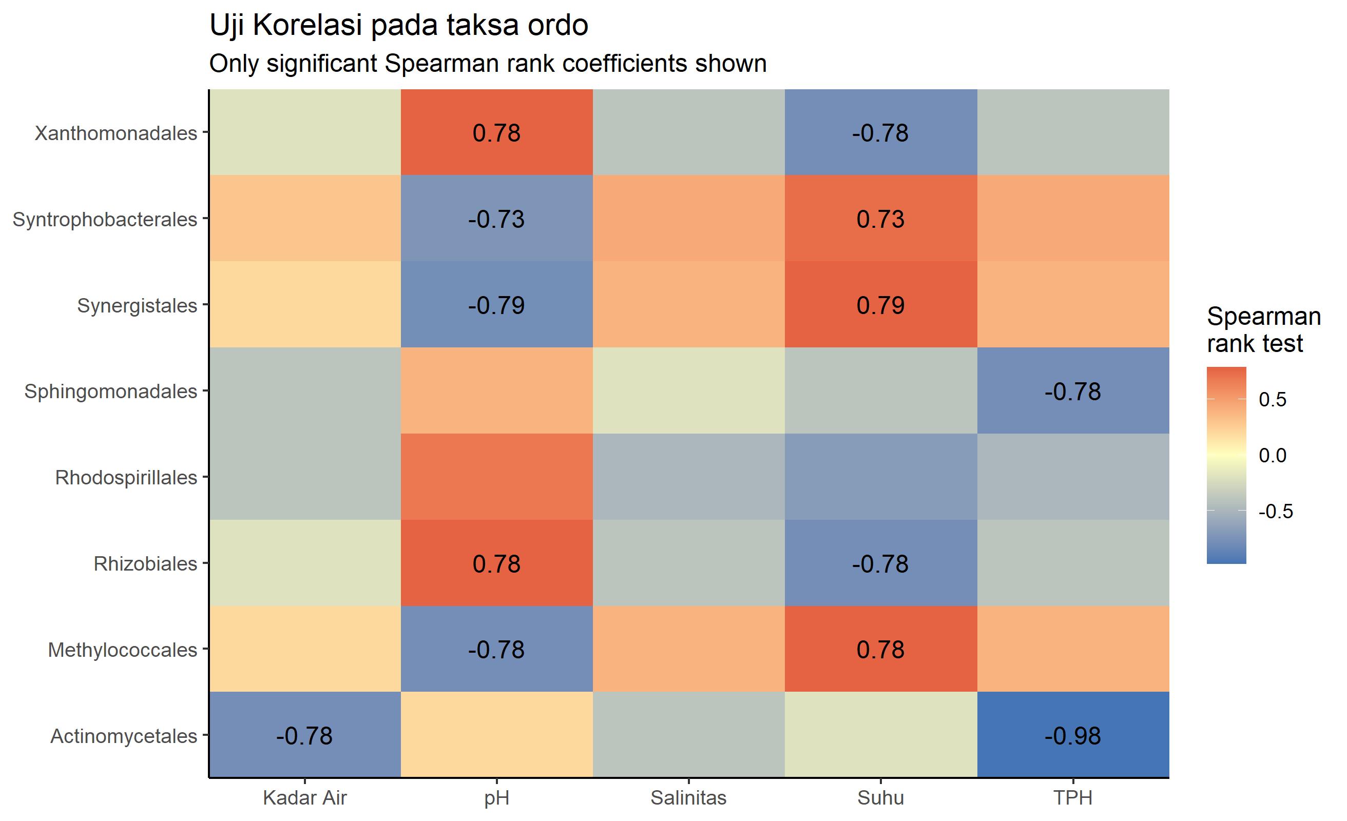
I’m also familiar with bioinformatics tools like BLAST, GenBank, UniProt, and the SILVA NGS database. My undergraduate thesis focused on microbiome profiling using Next Generation Sequencing (NGS) and the mothur pipeline. I’ve handled large biological datasets (e.g., genomics, proteomics) and collaborated with researchers across disciplines.
Feel free to explore my projects and publications, and don’t hesitate to get in touch if you’re interested in collaboration, consultation, or workshops in data visualization and computational biology.
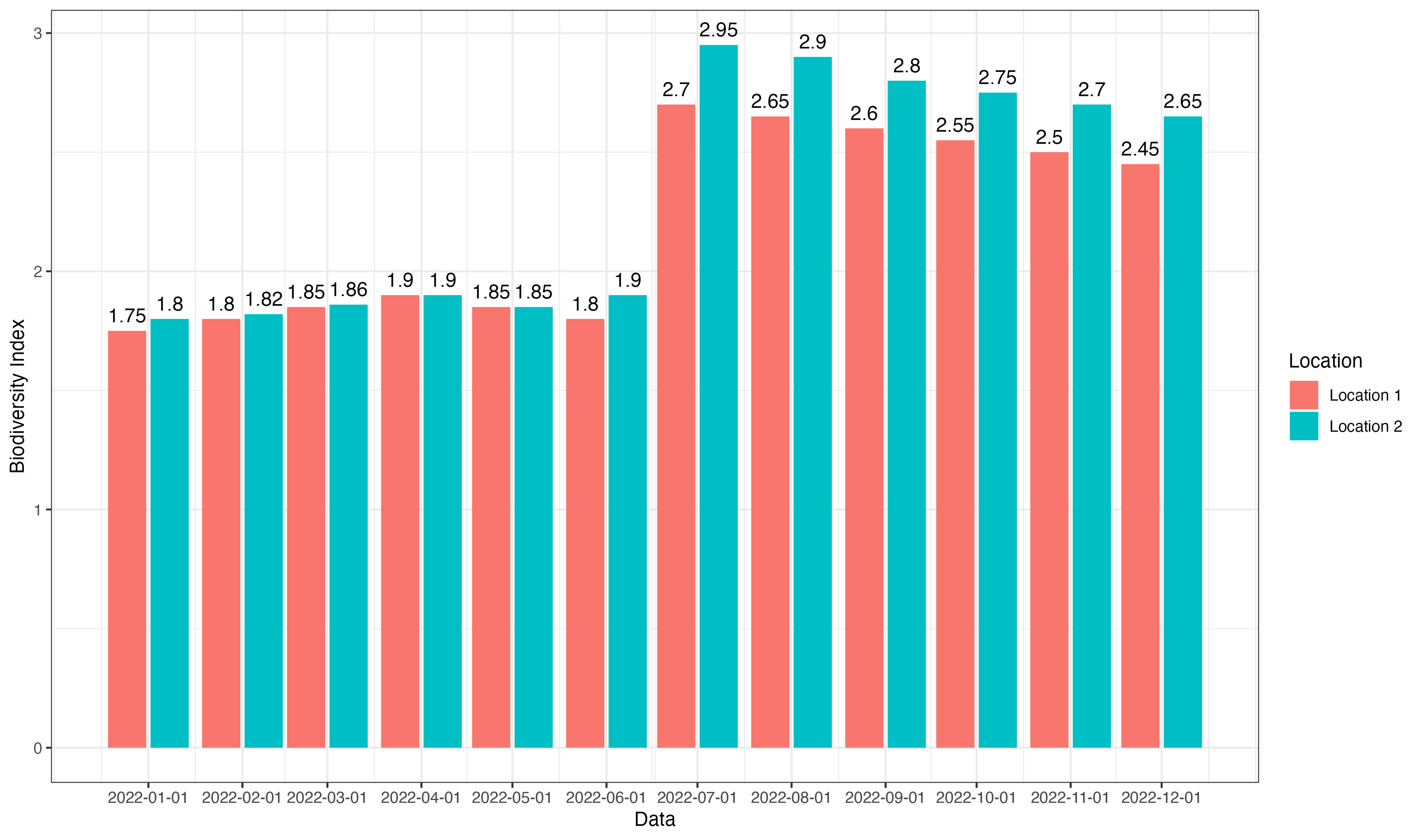
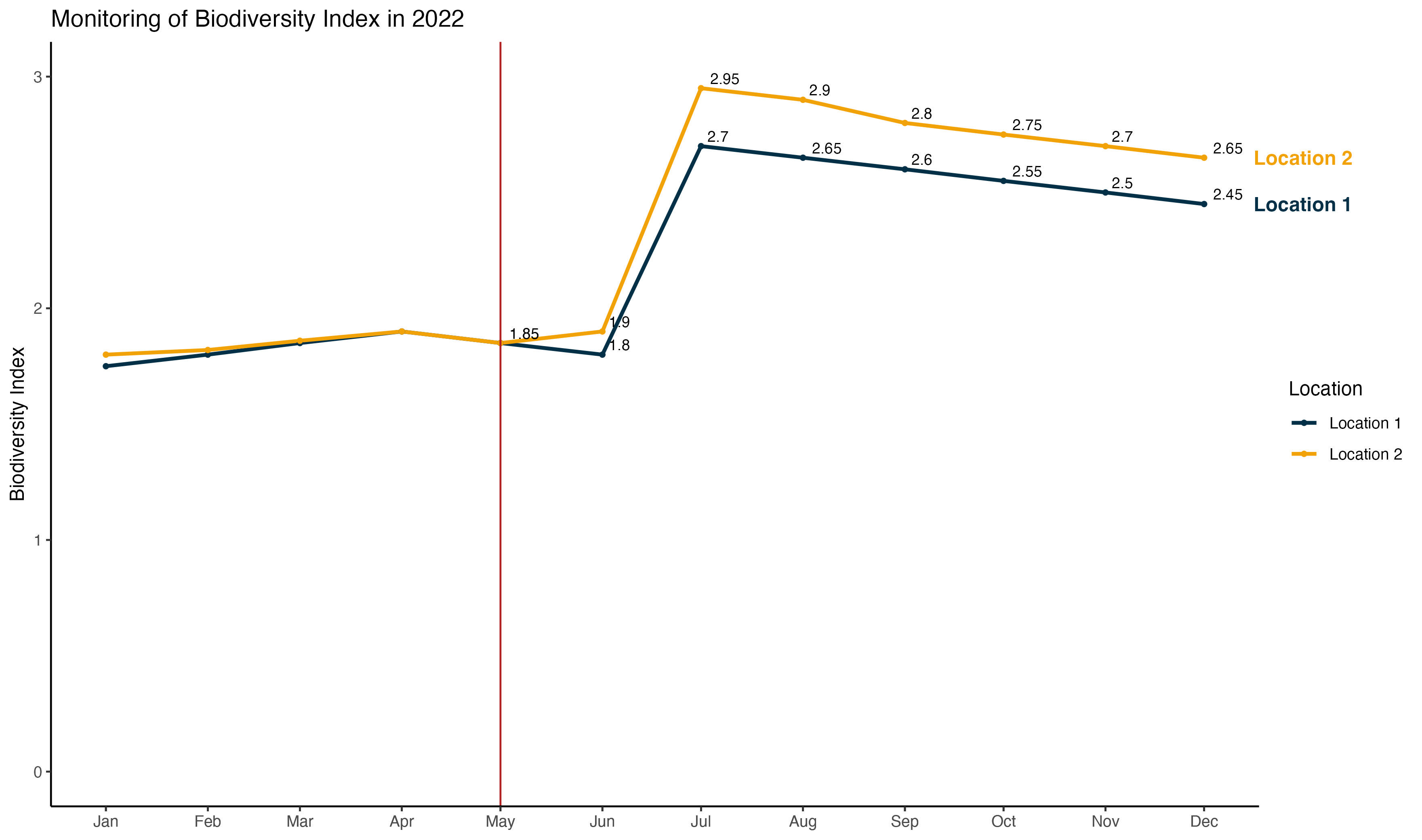
Static Visualizations
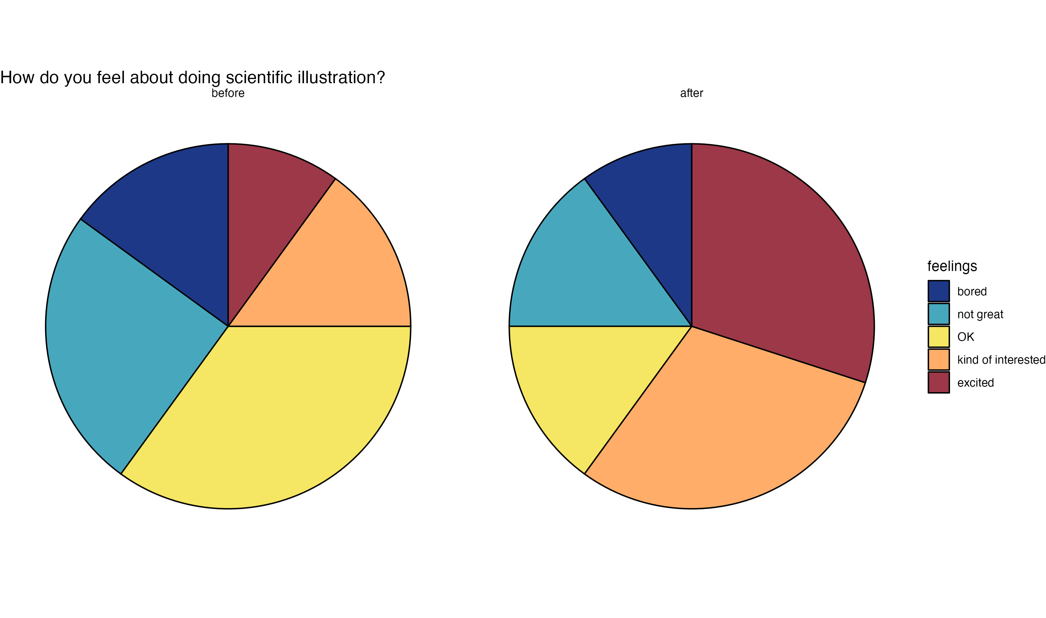
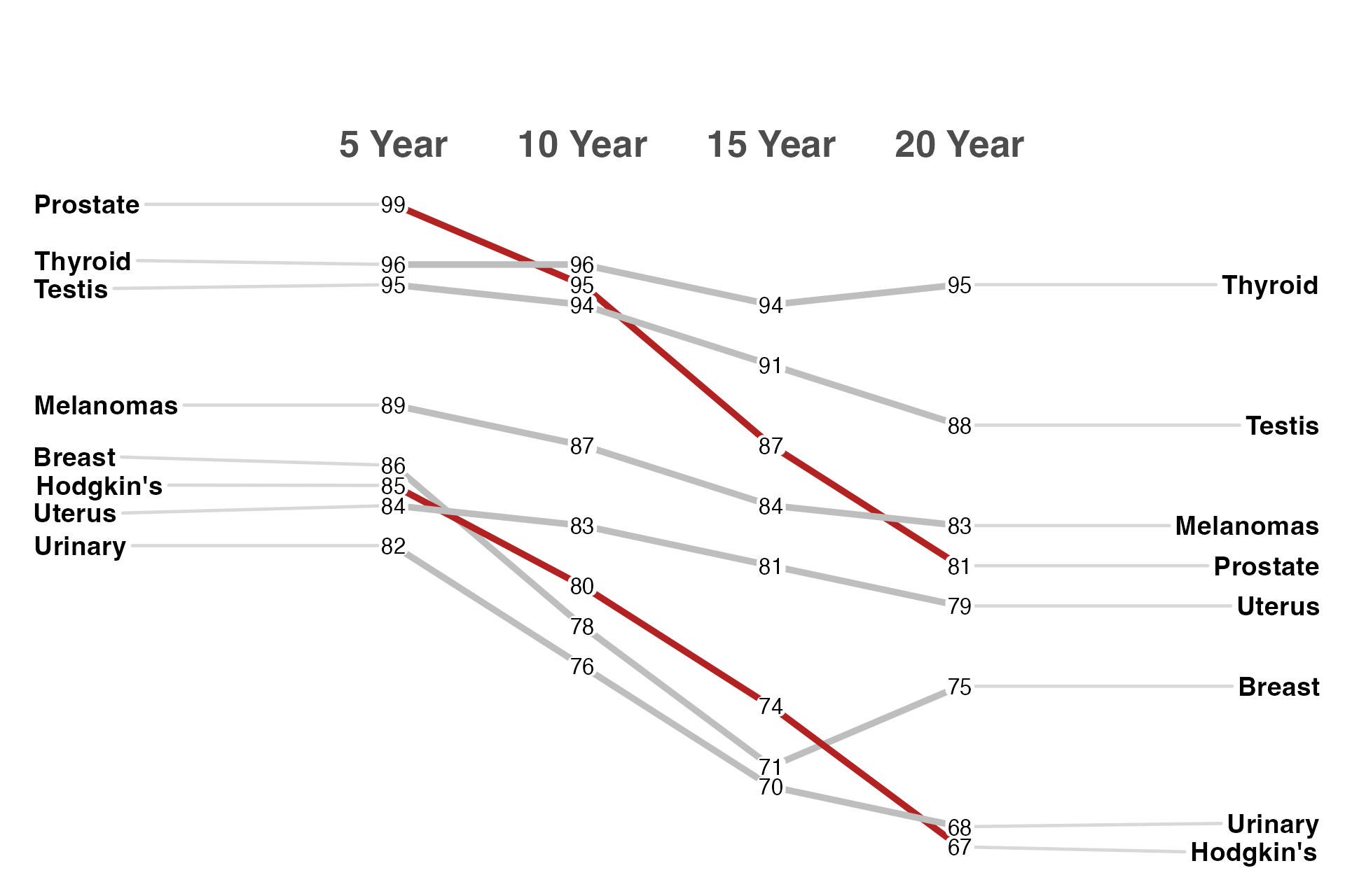
Storytelling with Data
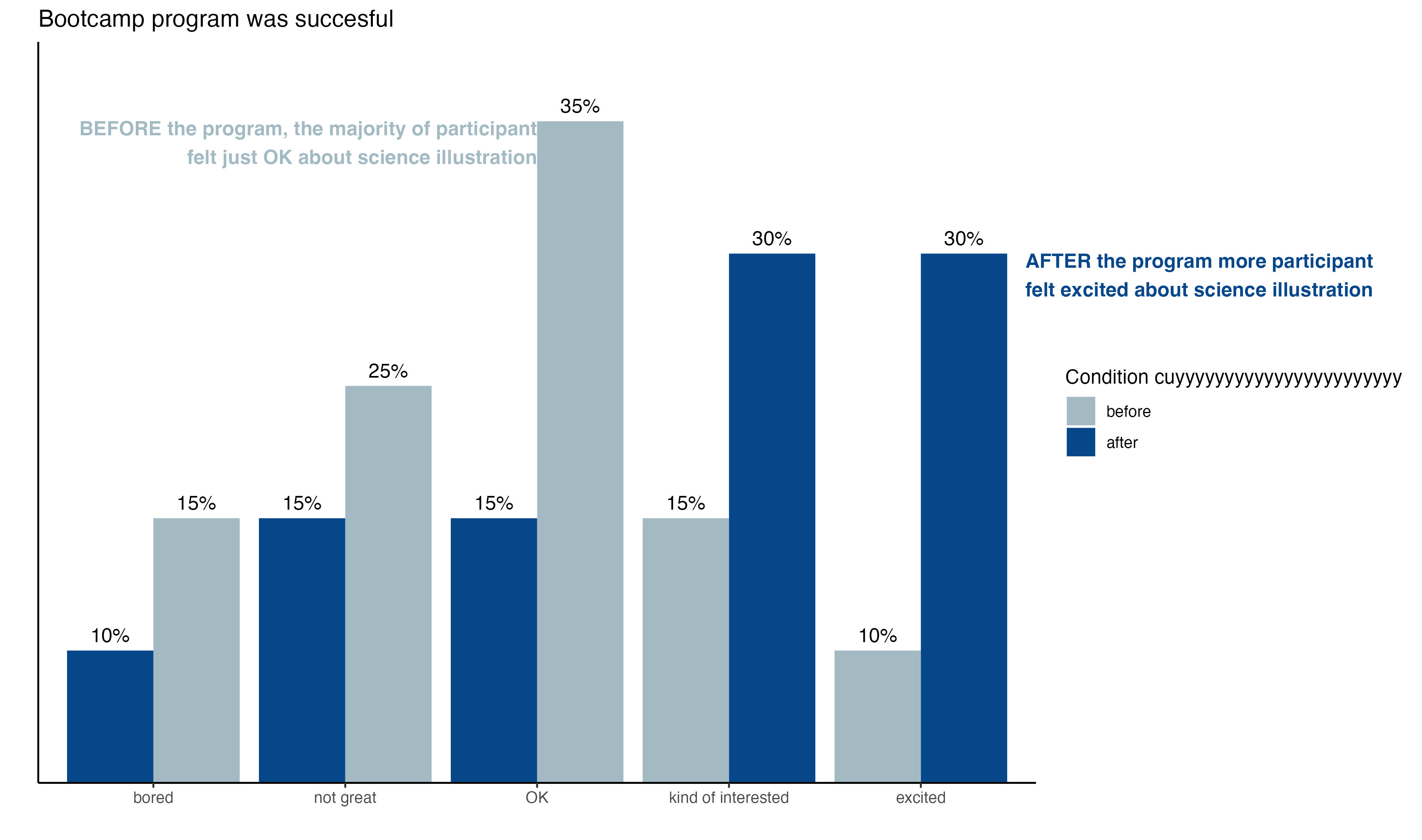
A collection of before-after redesigns demonstrating principles of effective visual communication.
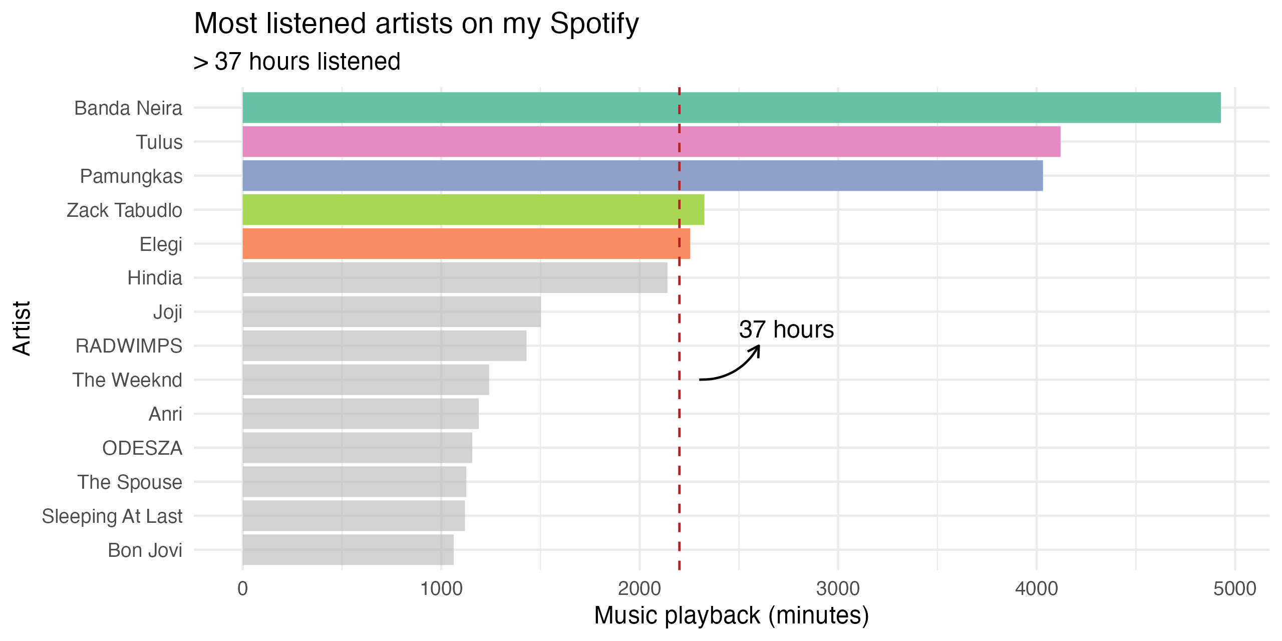
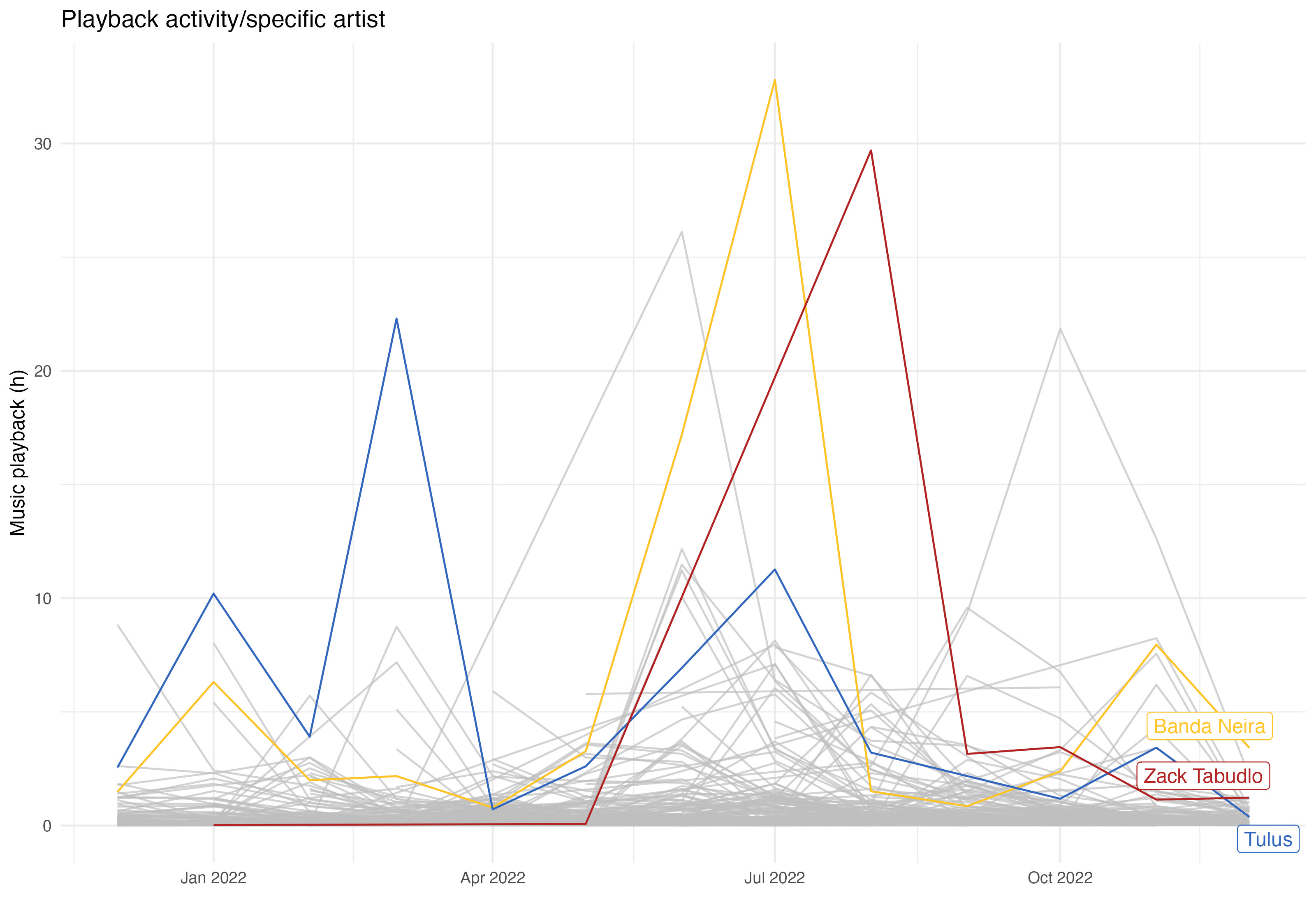
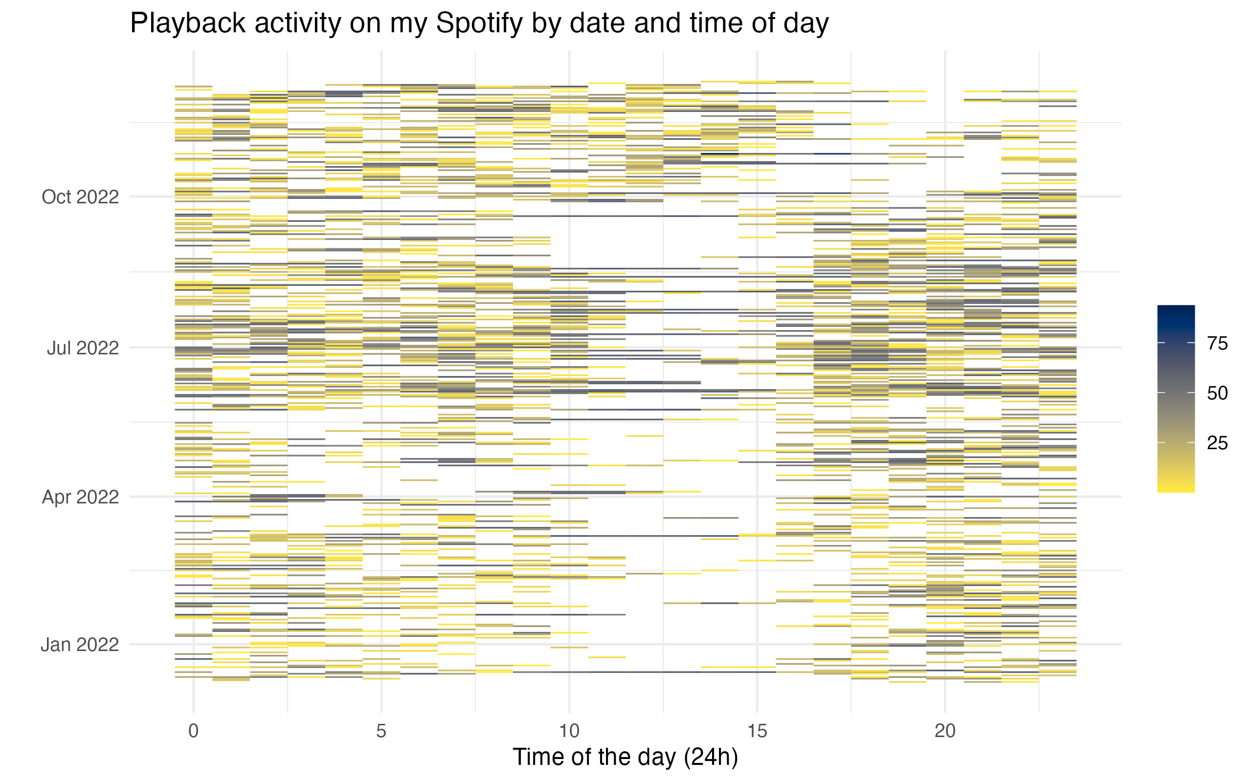
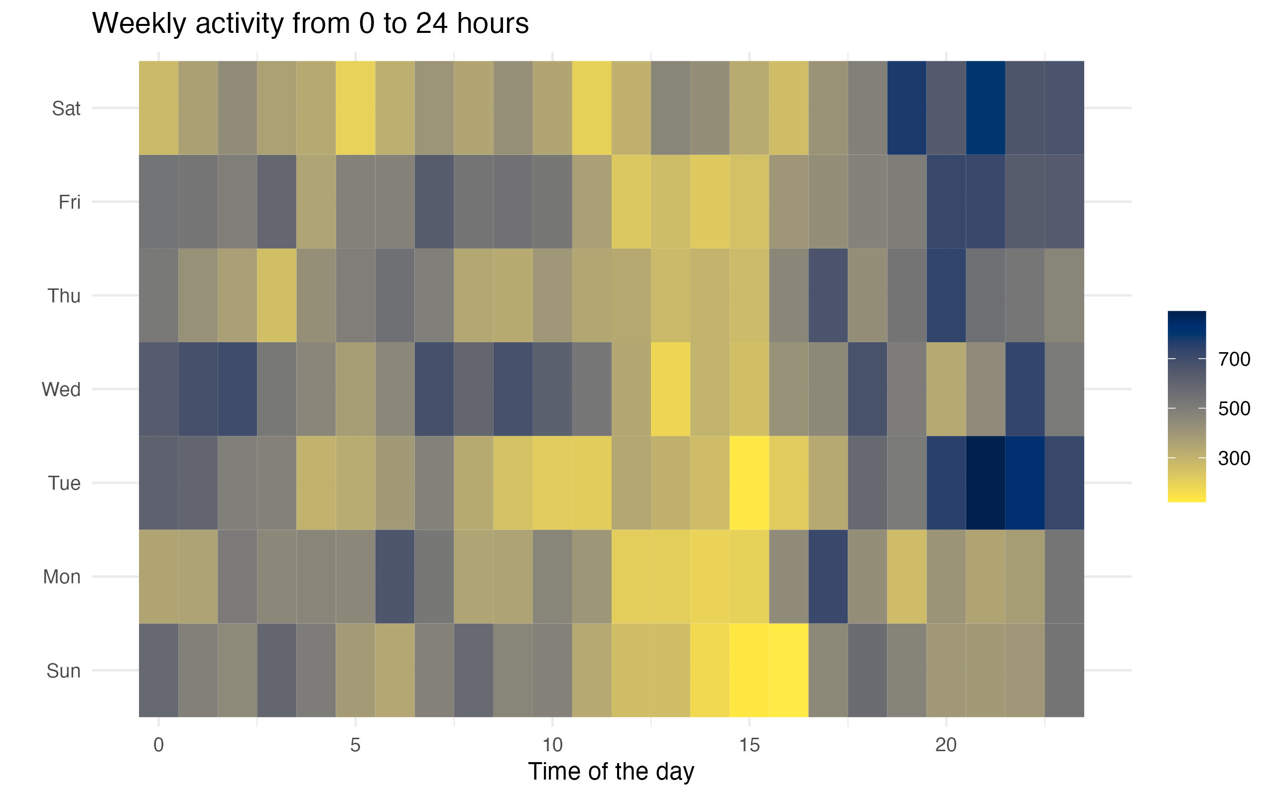
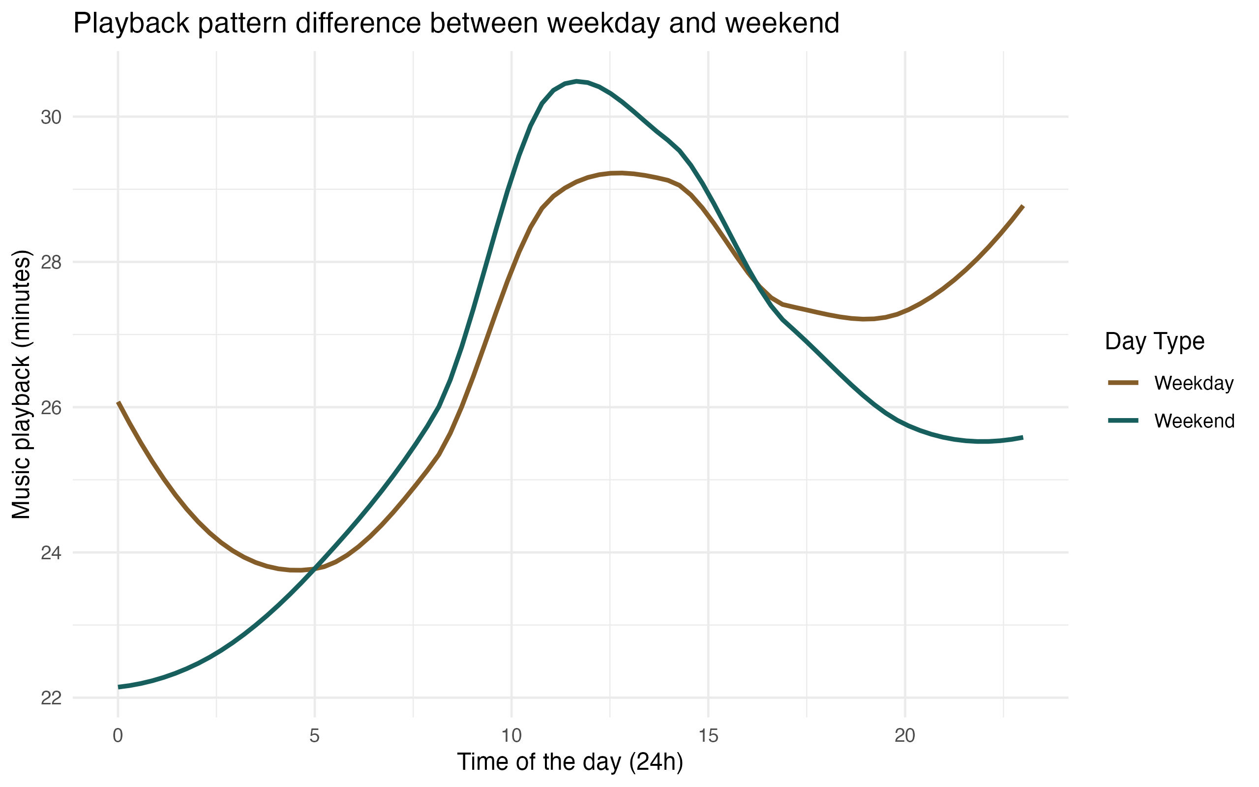
Spotify Playback 2022 Analysis
An exploration of my 2022 music listening habits using tidyverse and ggplot2.
For a full walkthrough, visit this blog post.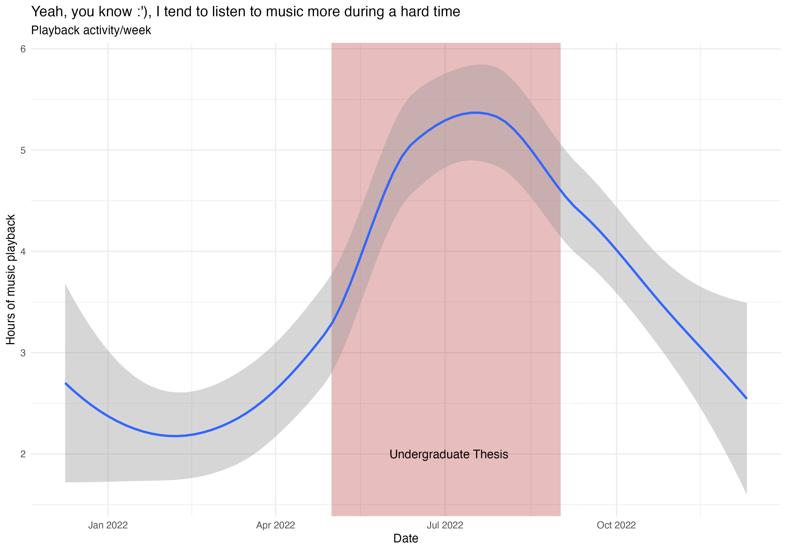
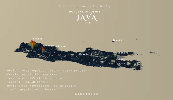
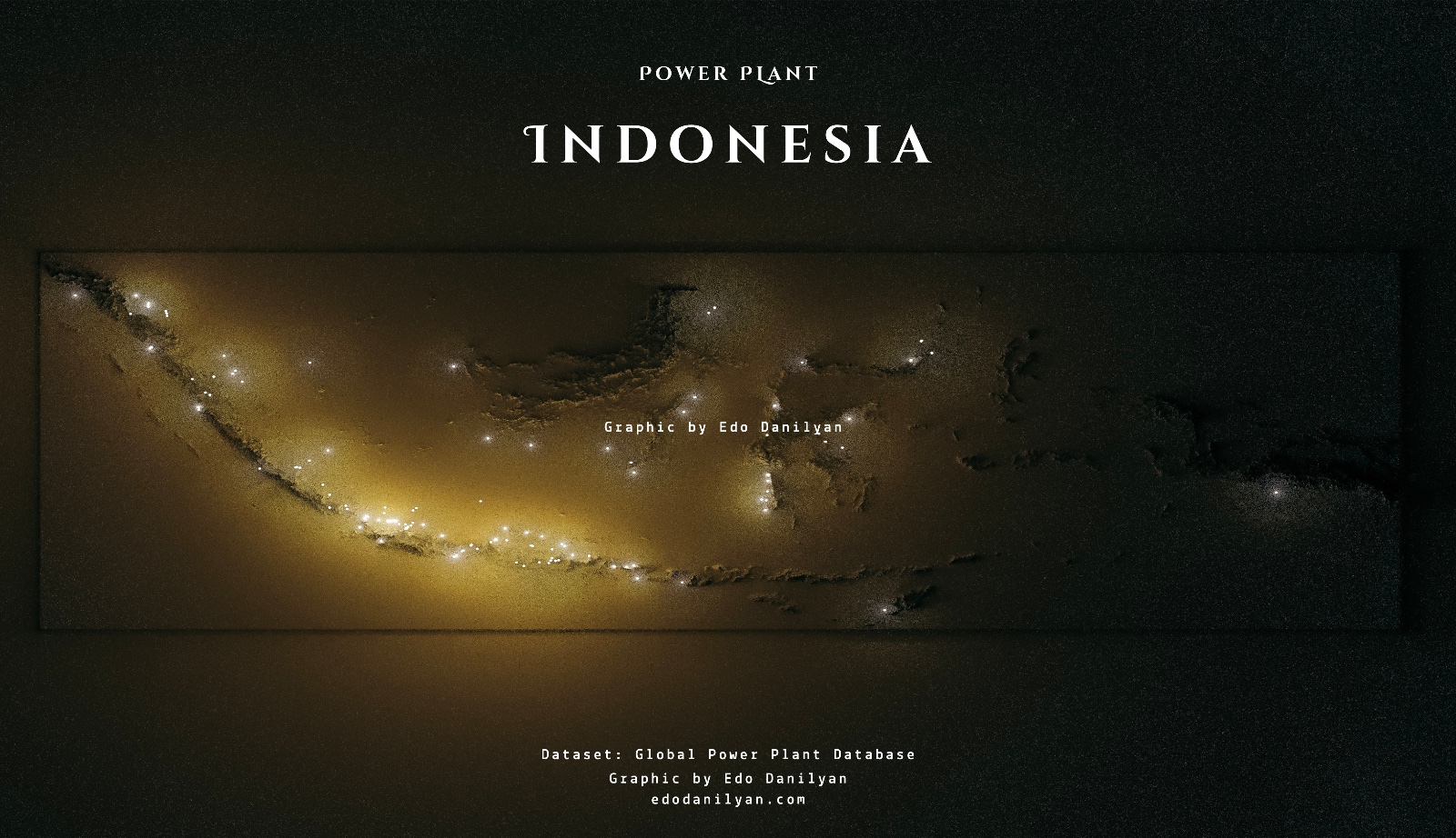
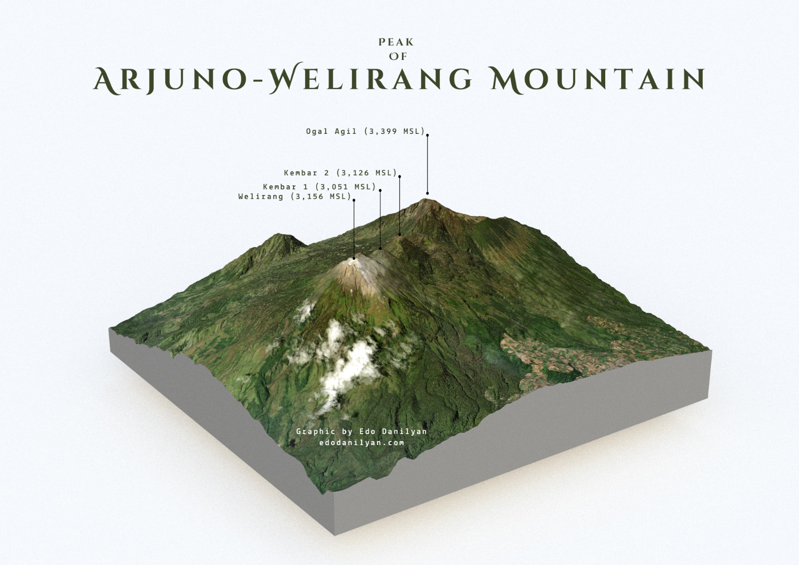
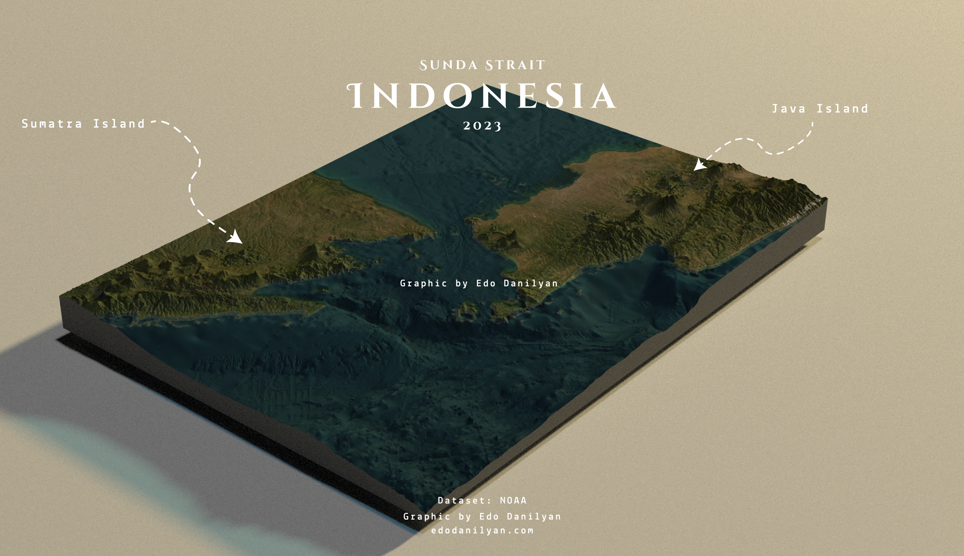
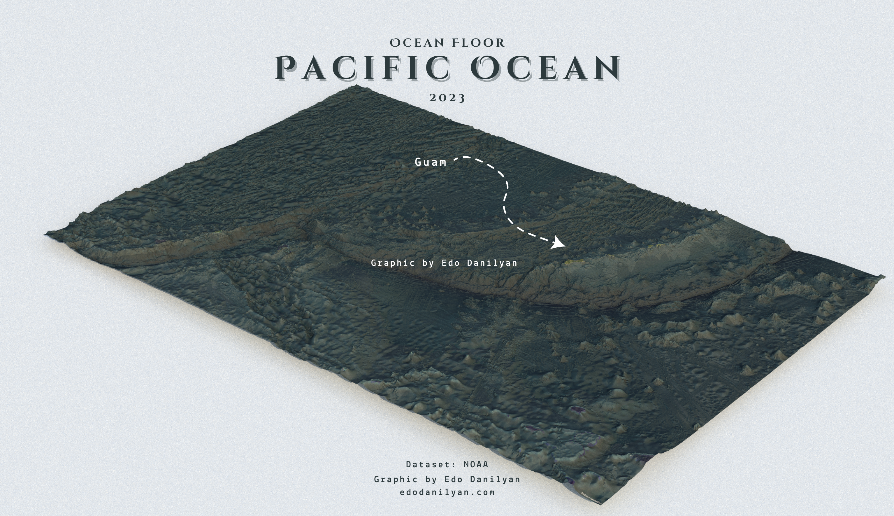
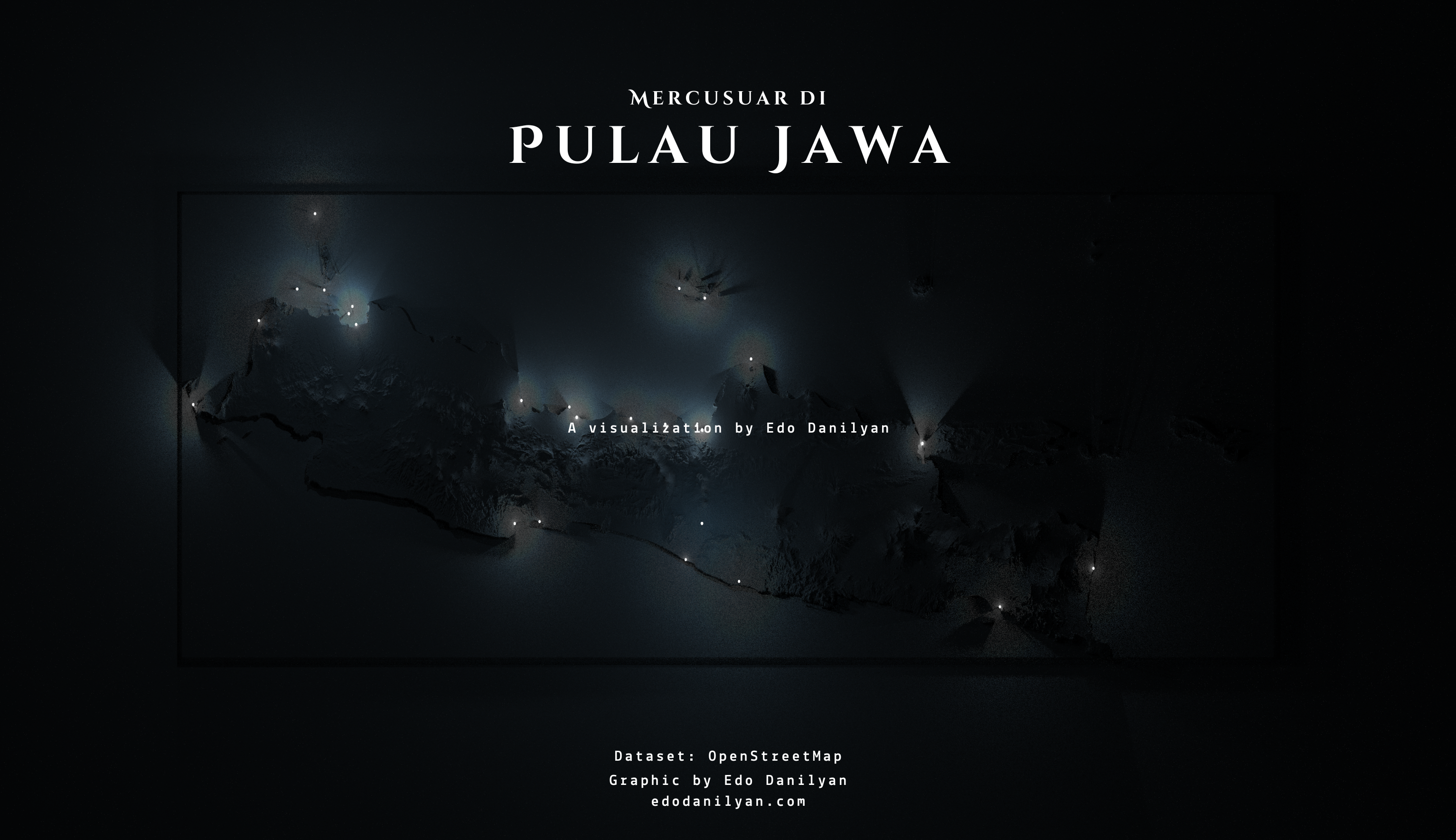
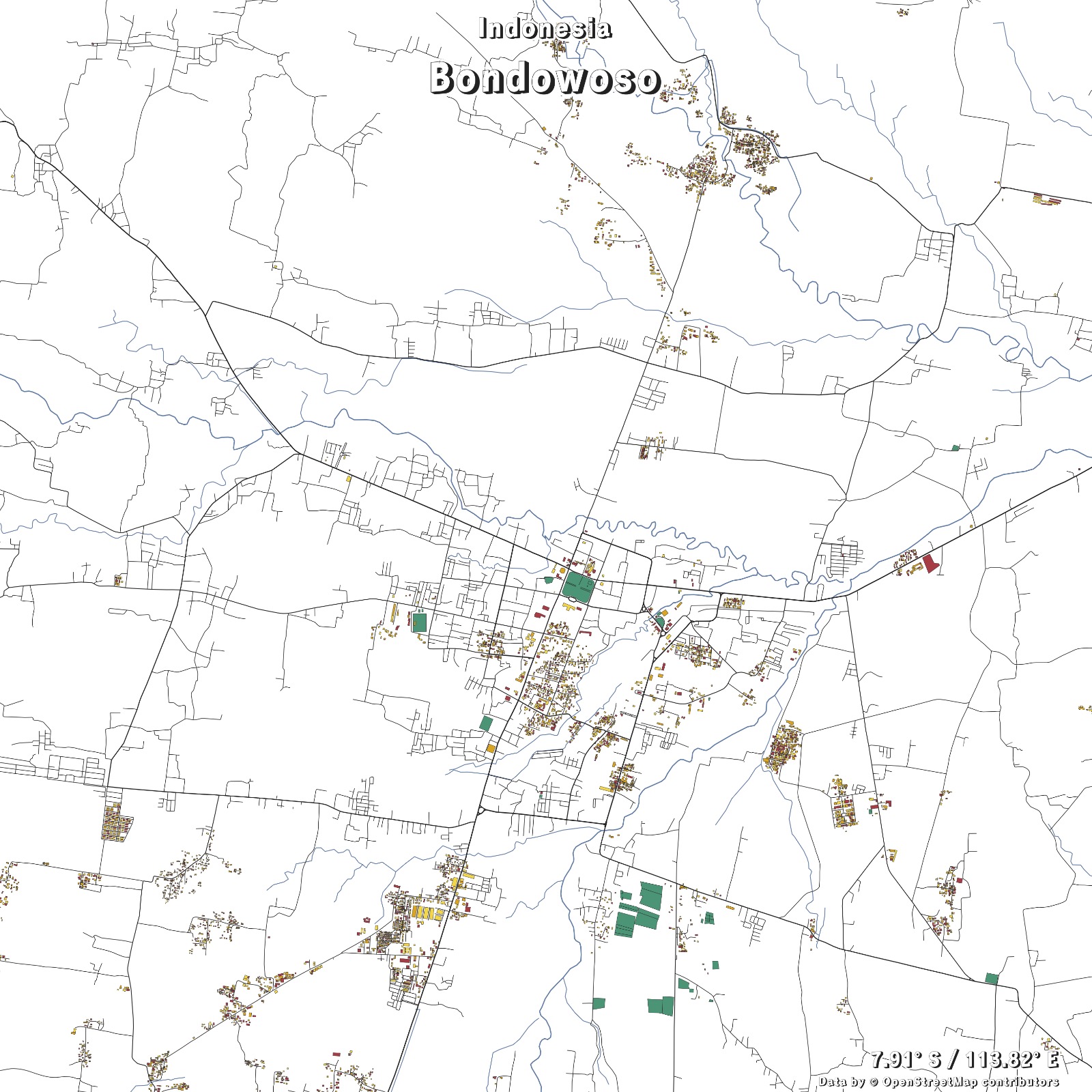
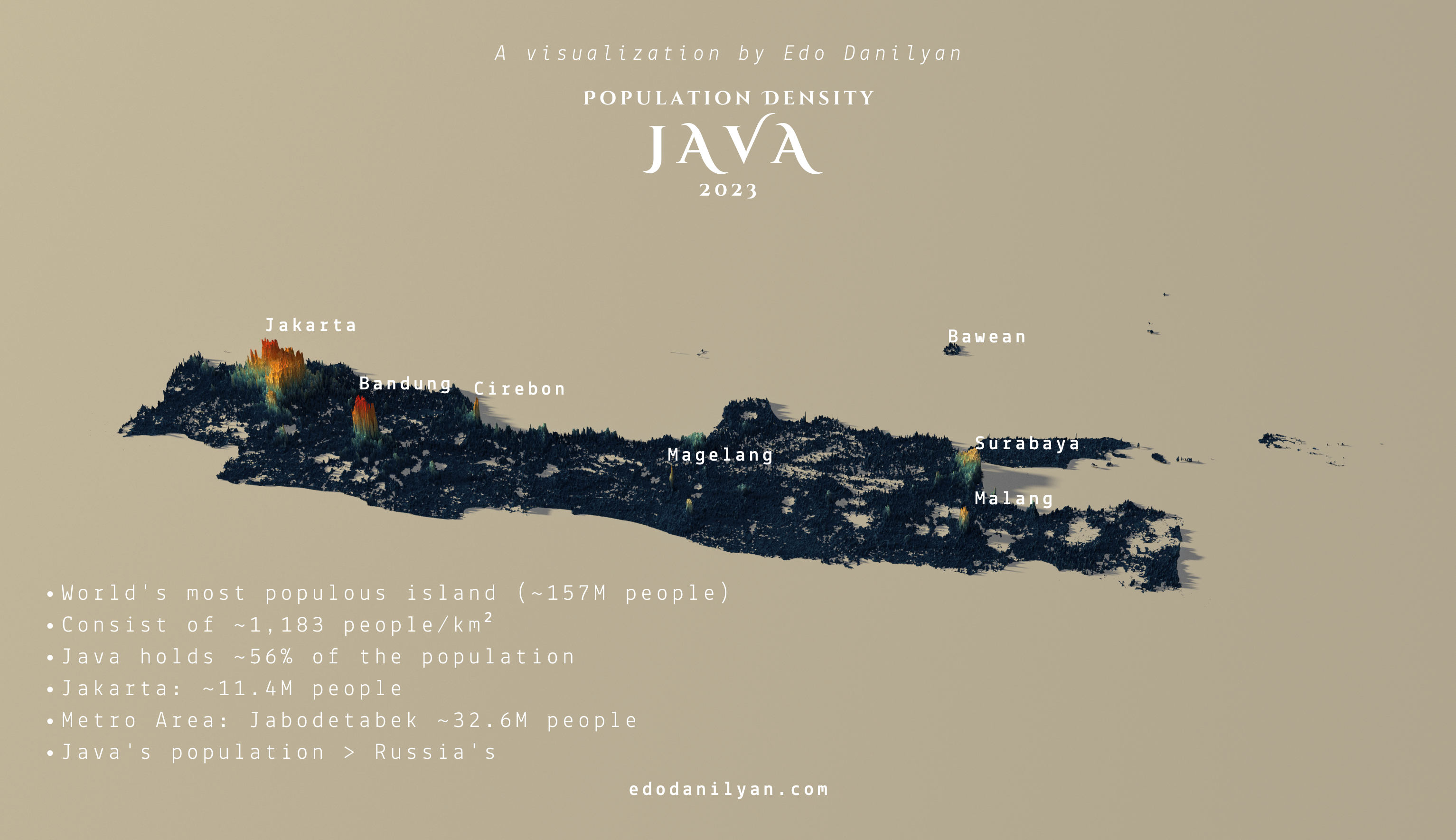
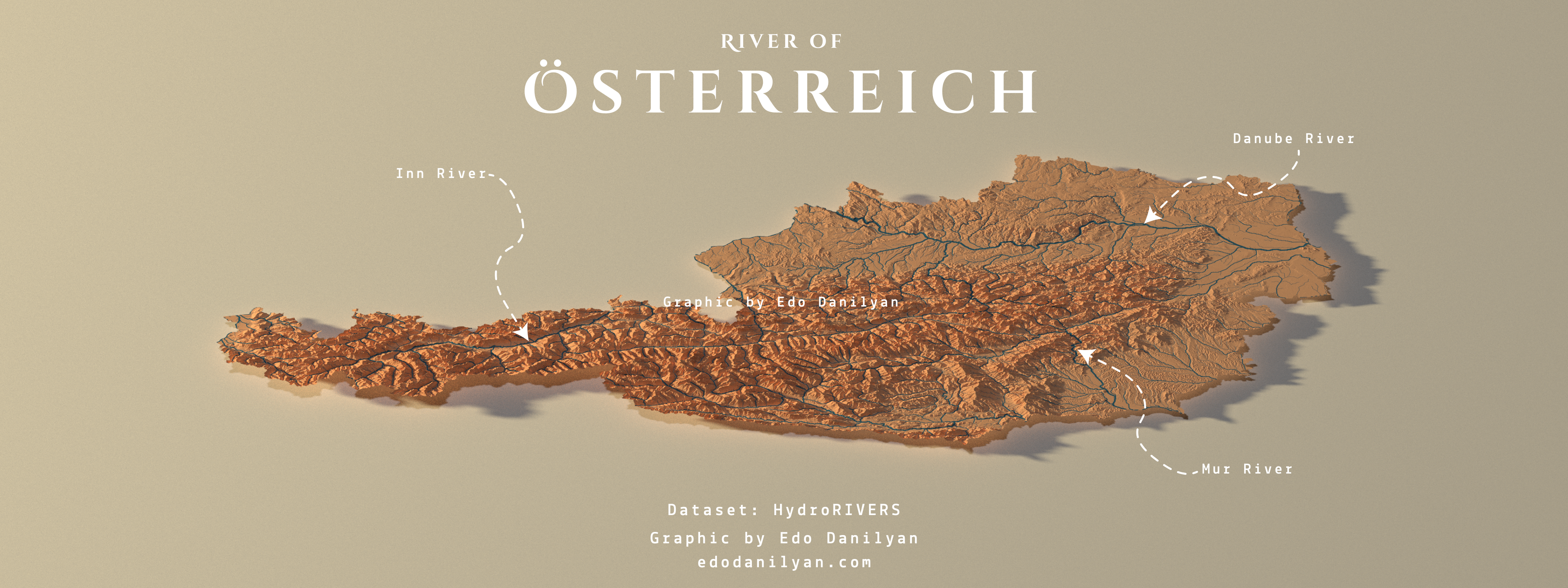
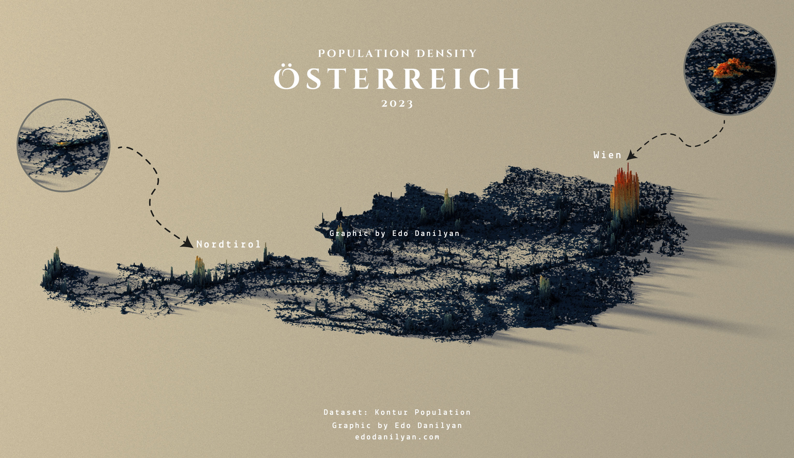
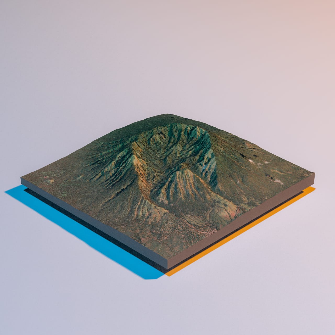
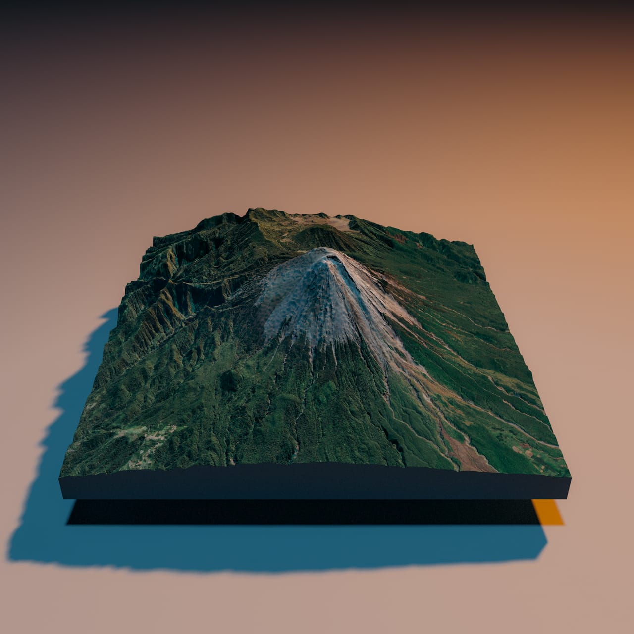
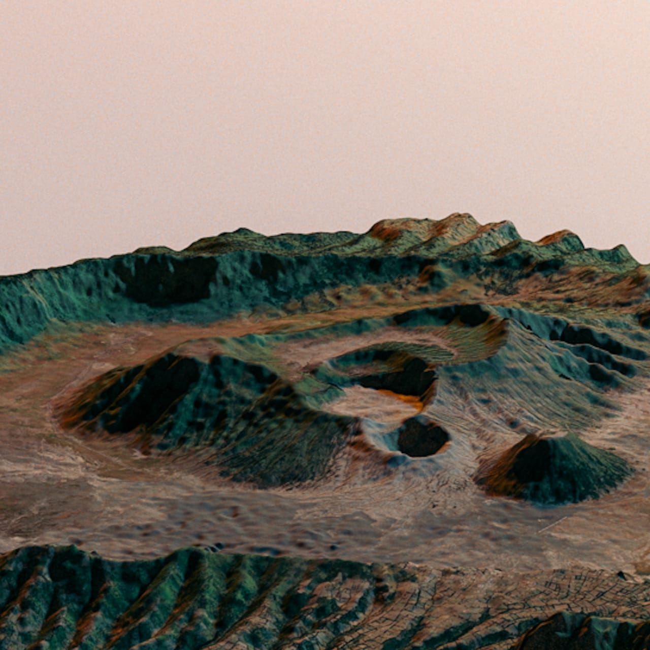
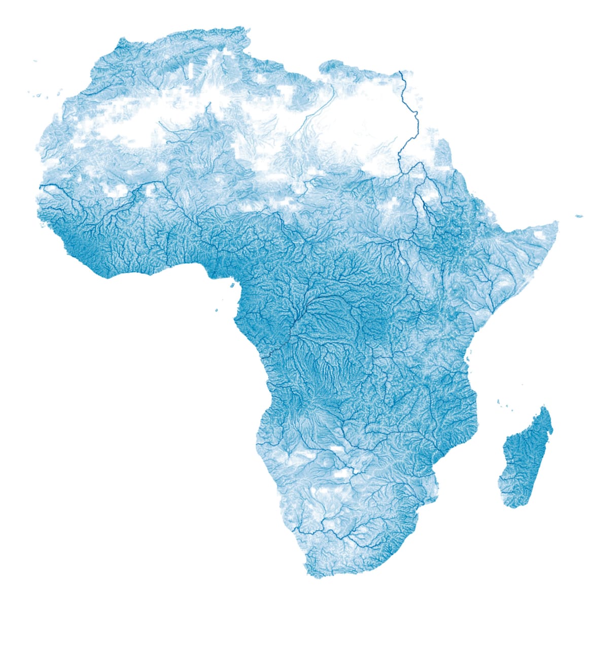
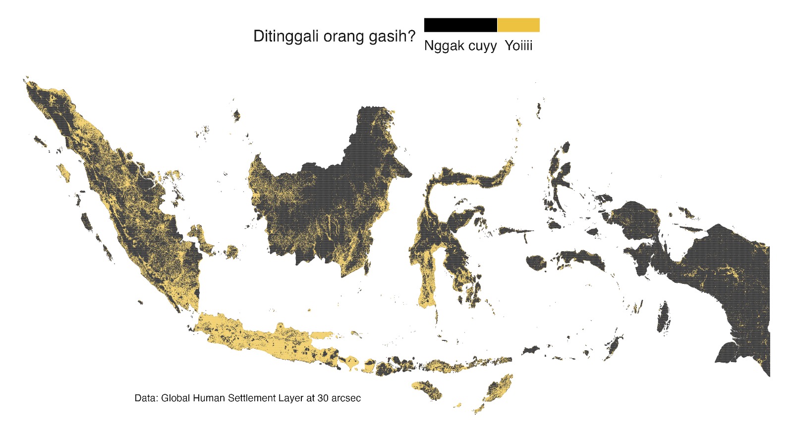
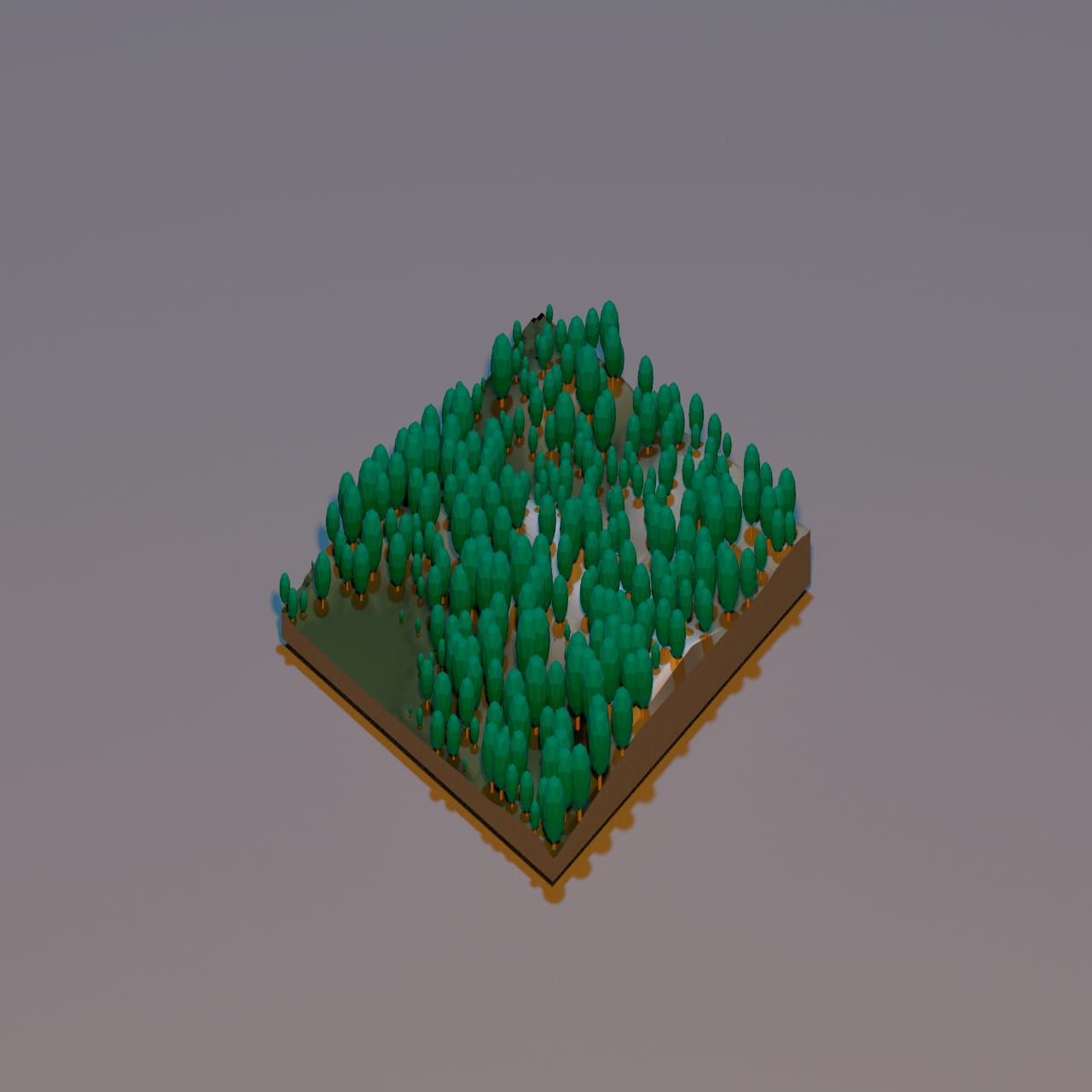
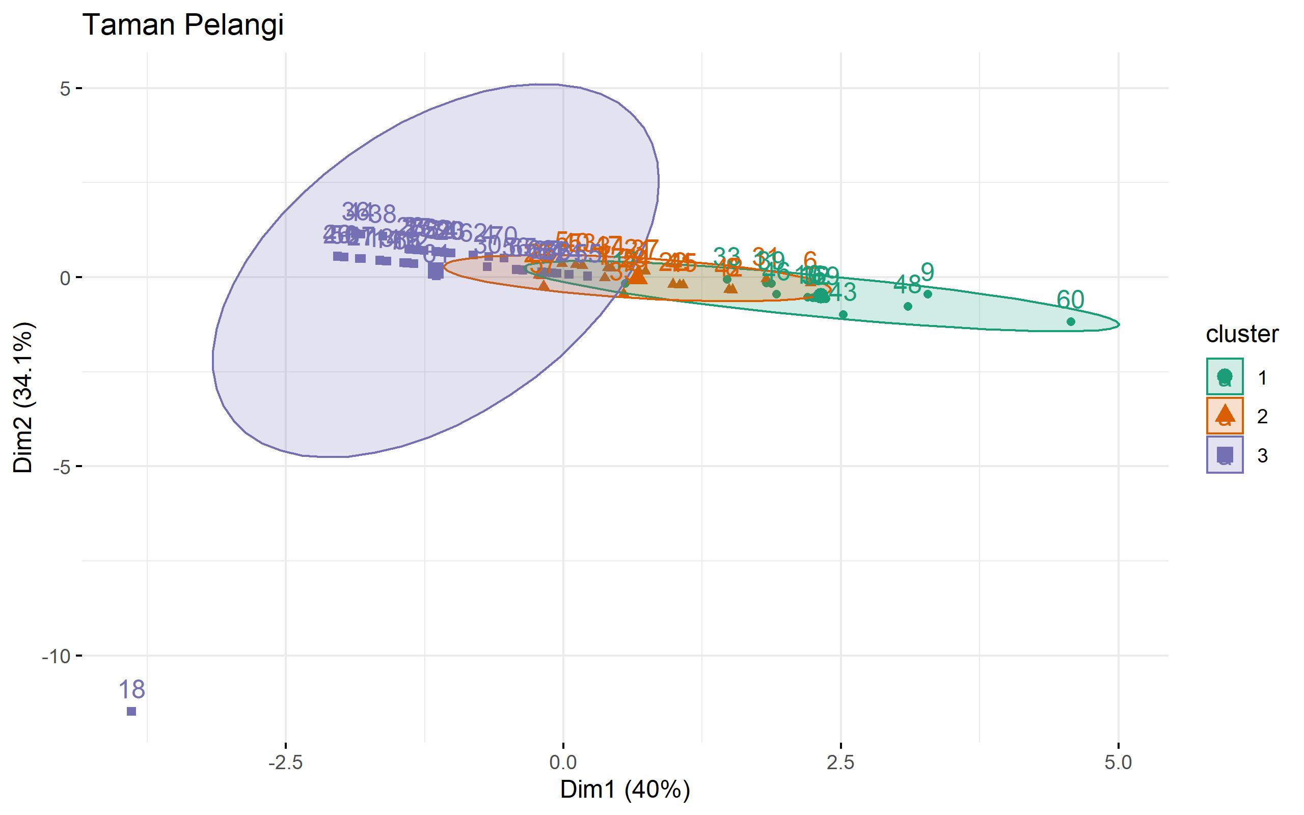
R Geospatial Visualizations
Geospatial mapping projects created using ggplot2, rayshader, and tmap.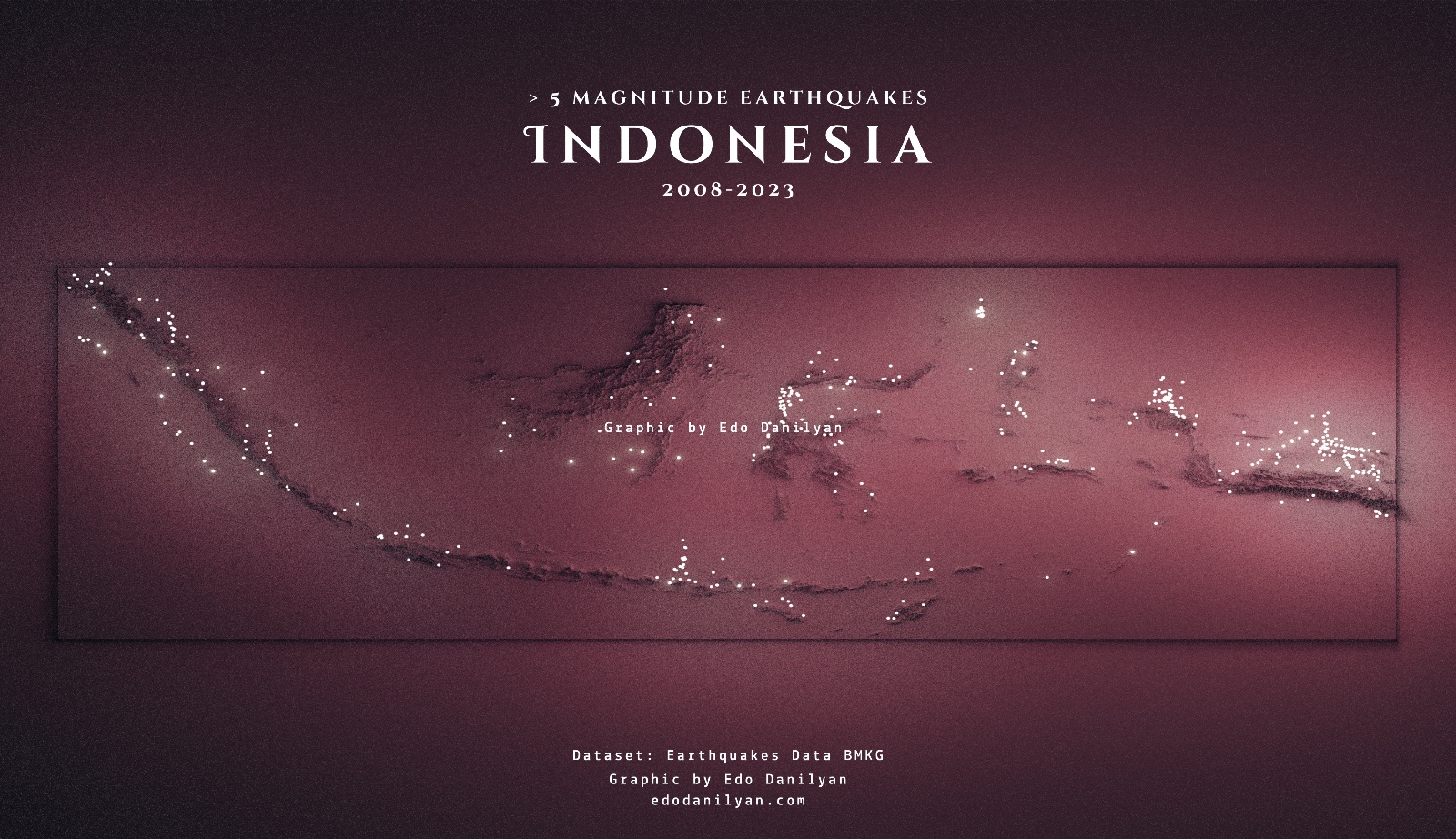
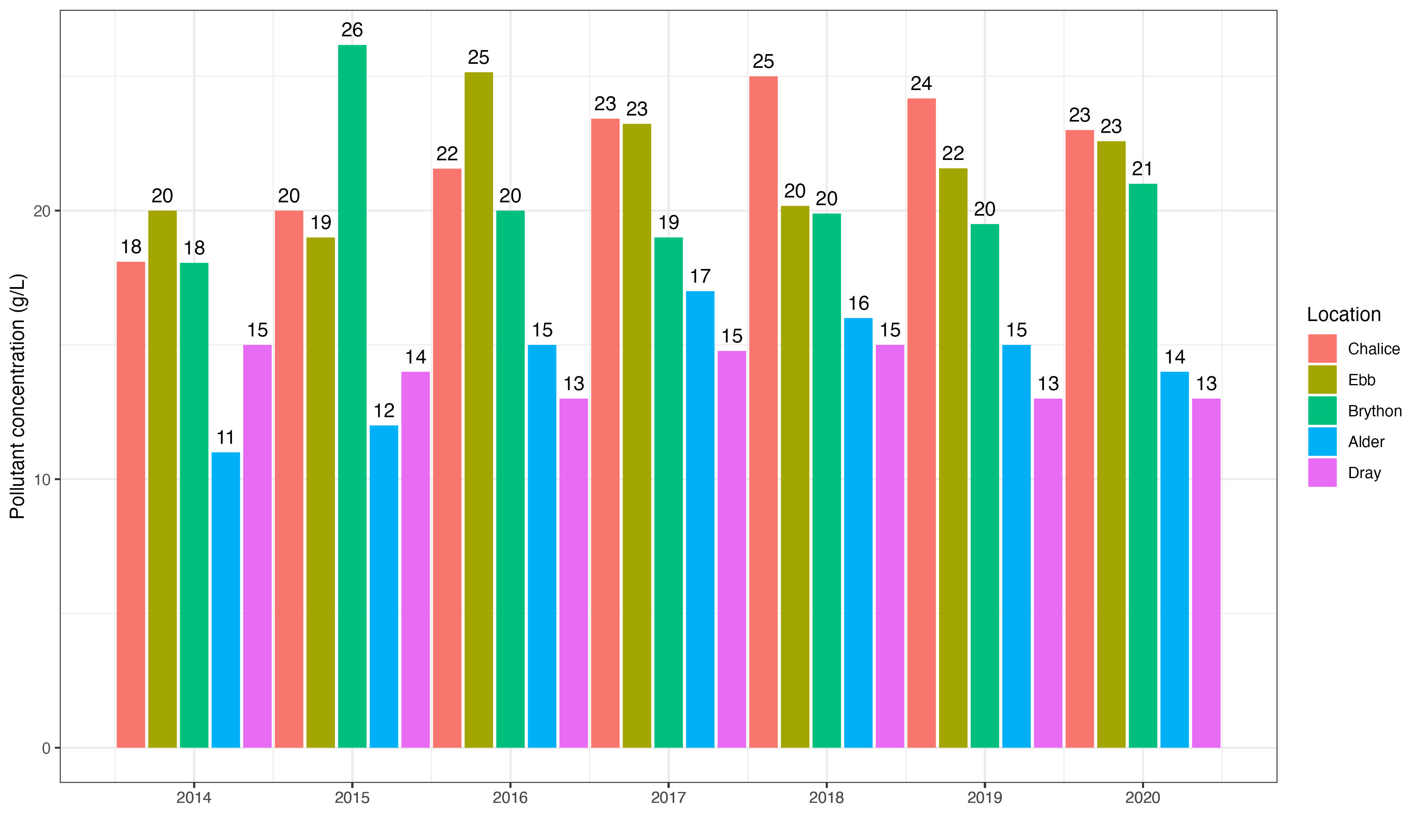
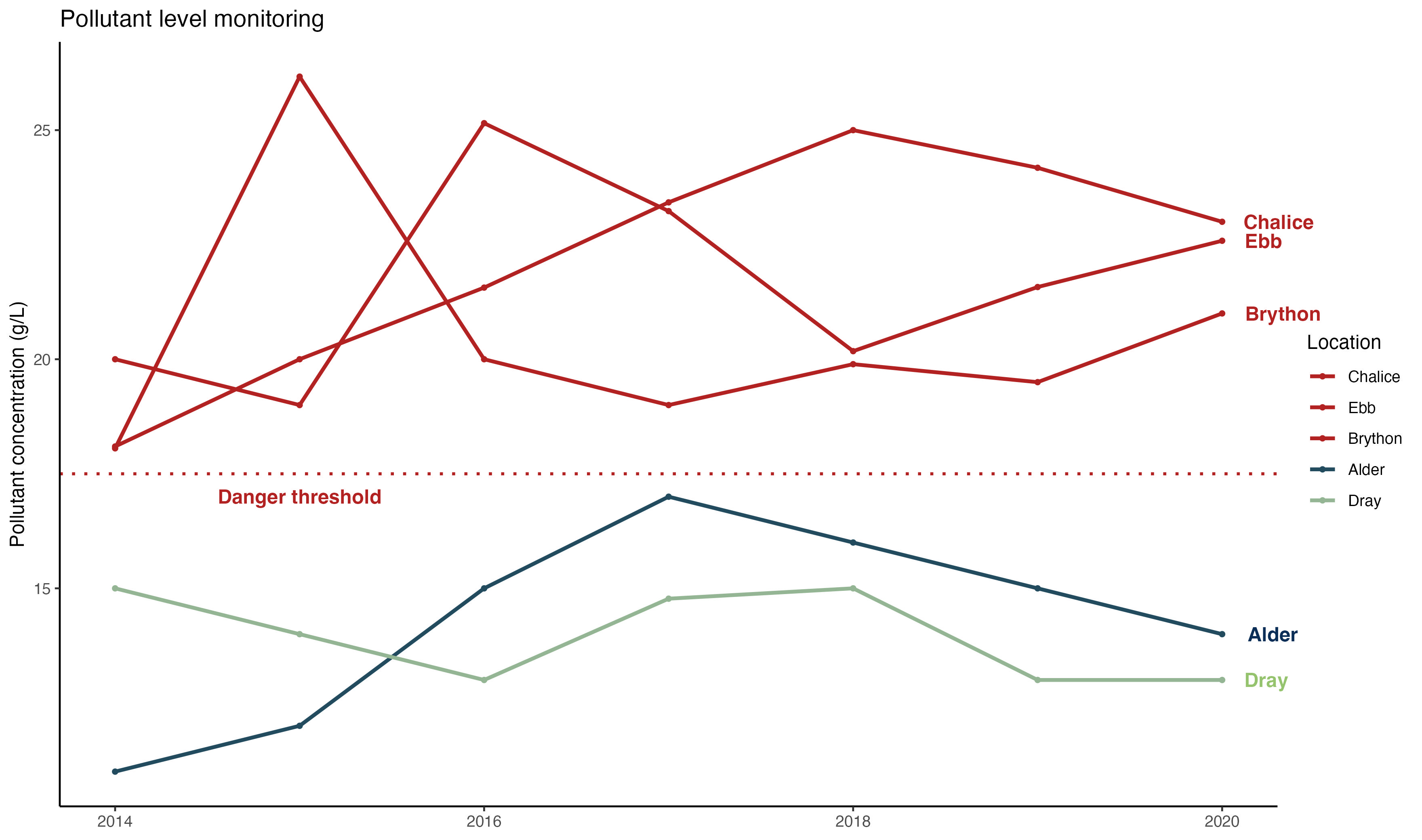
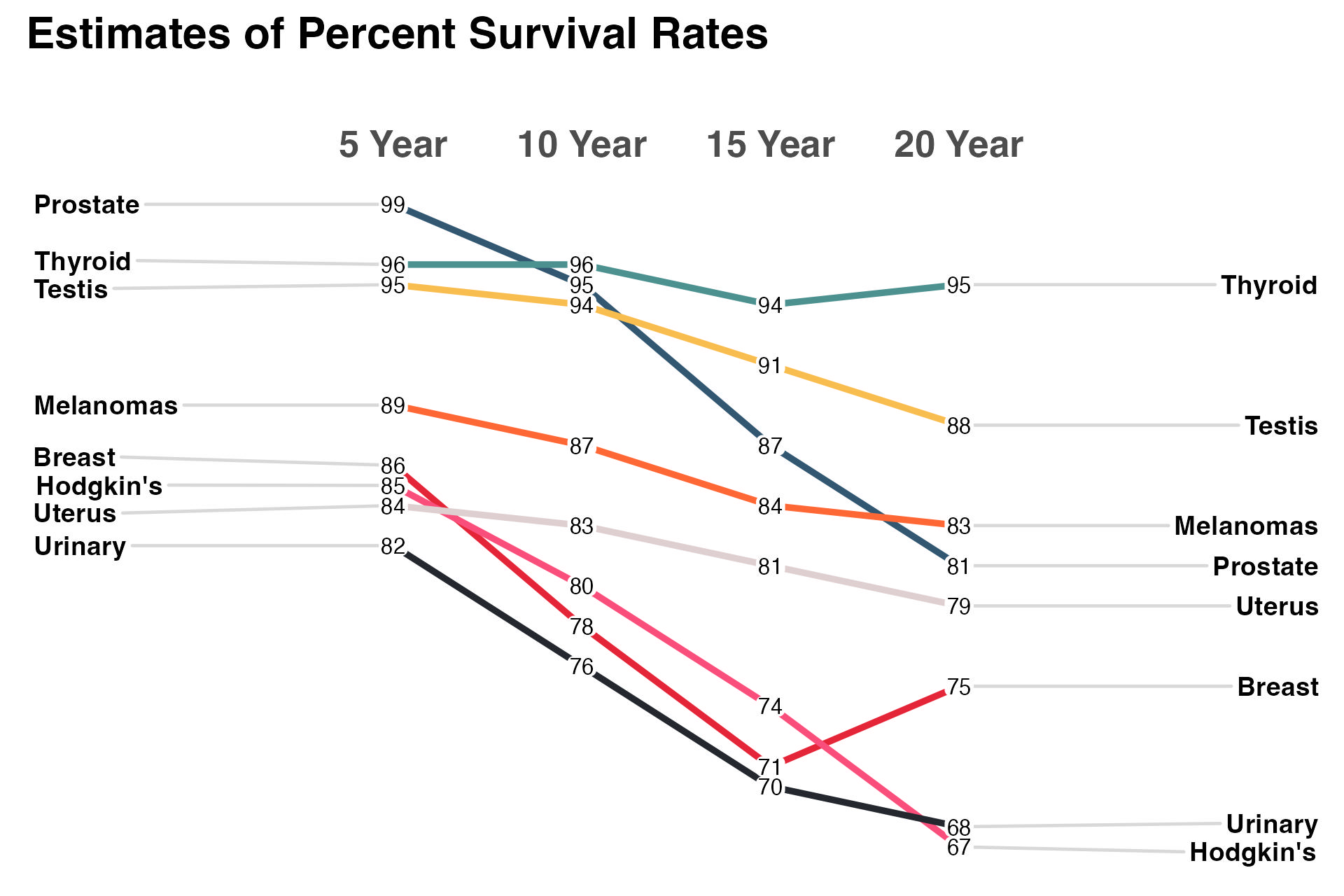
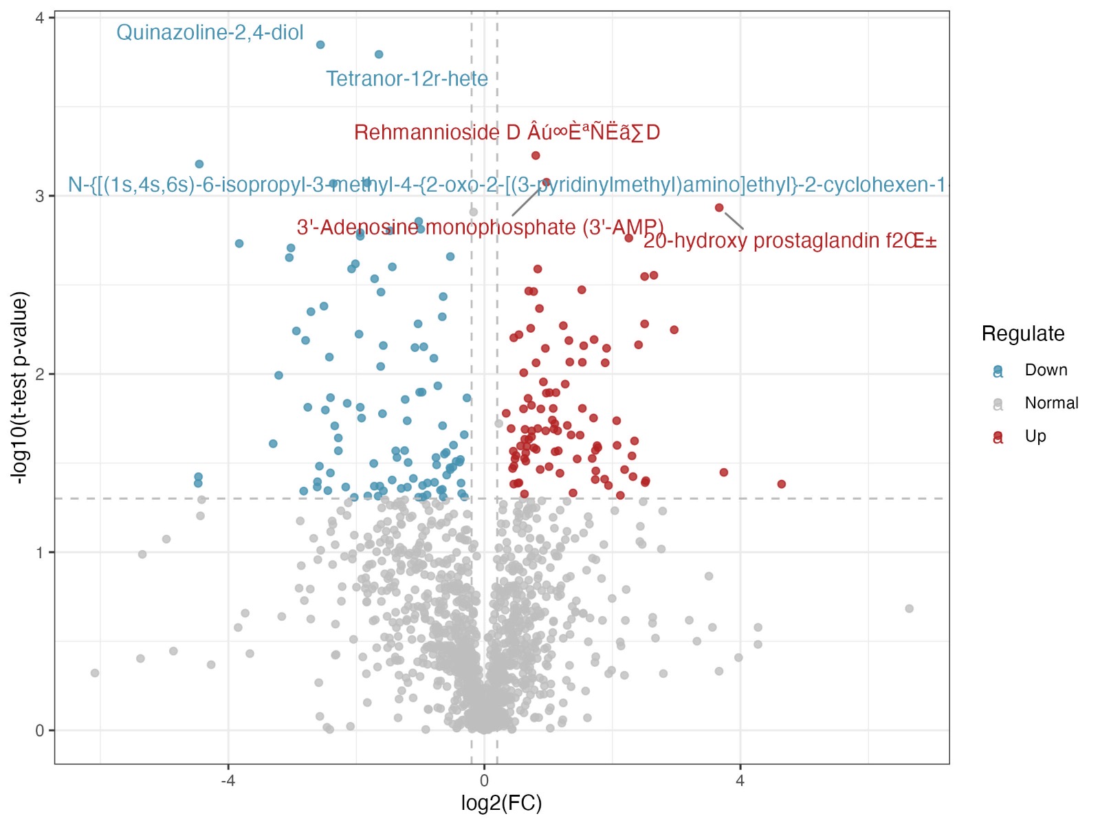
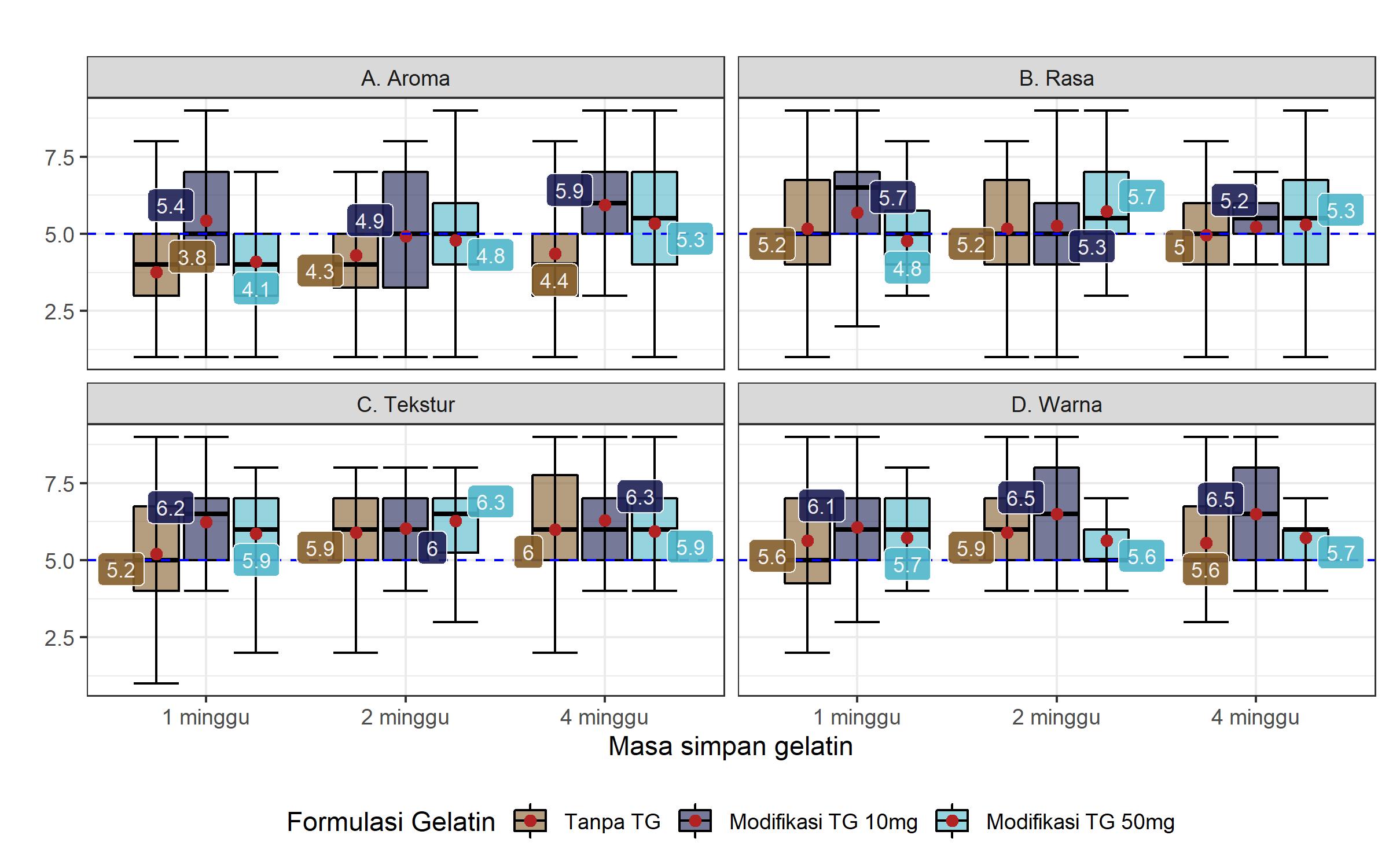
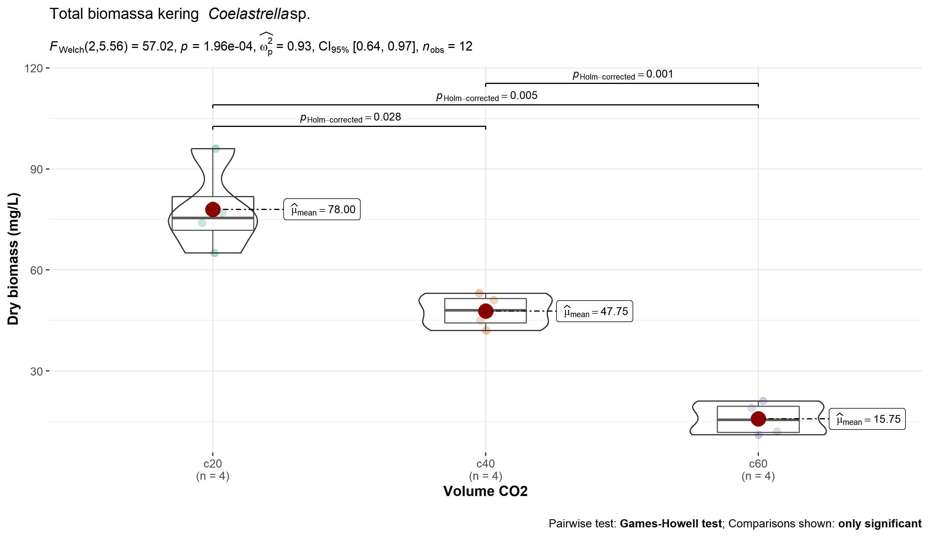
Static Plot Collection
Assorted plots from coursework, side projects, and tutorials.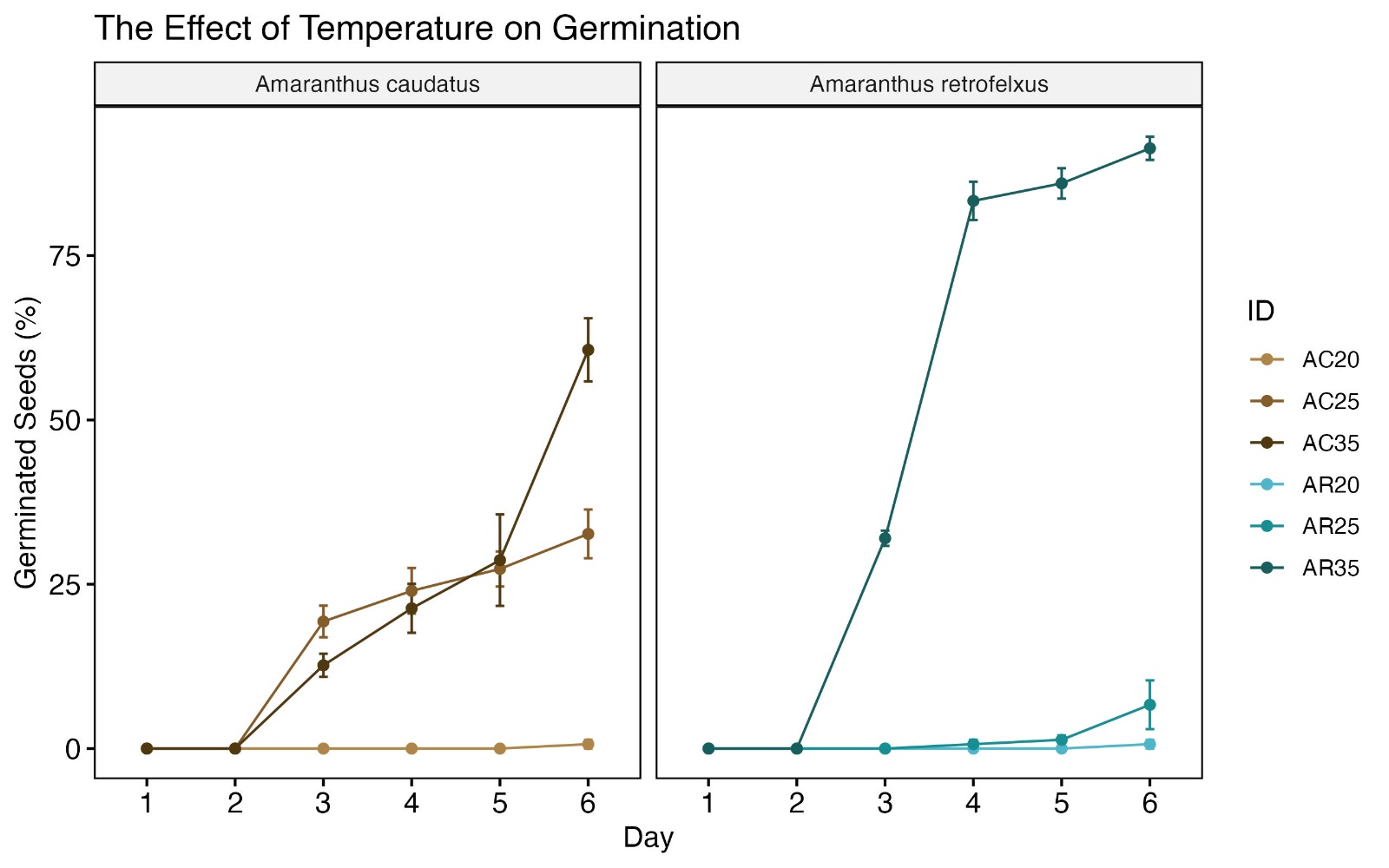
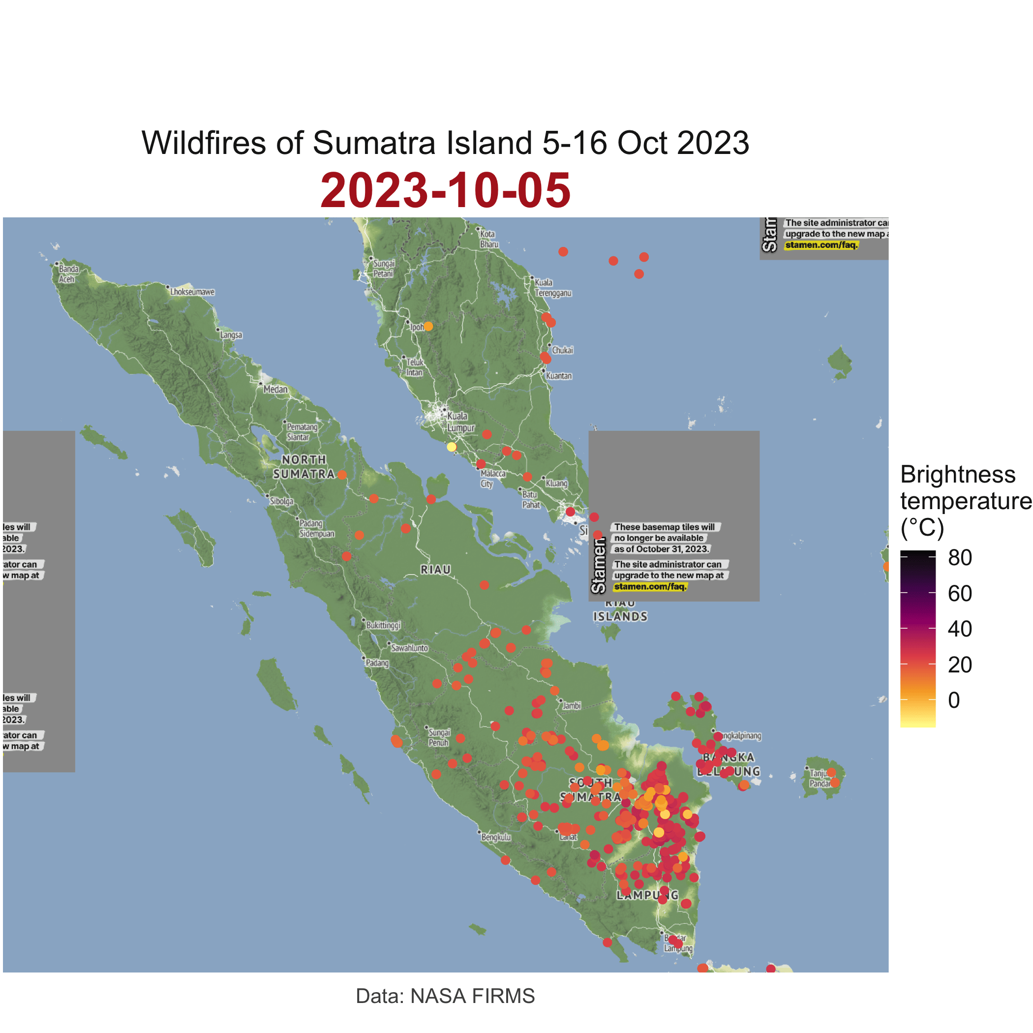
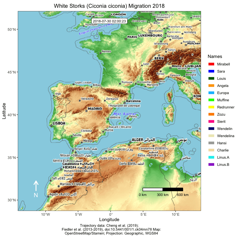
Animated Visualizations
Perfect for dynamic presentations and highlighting temporal patterns.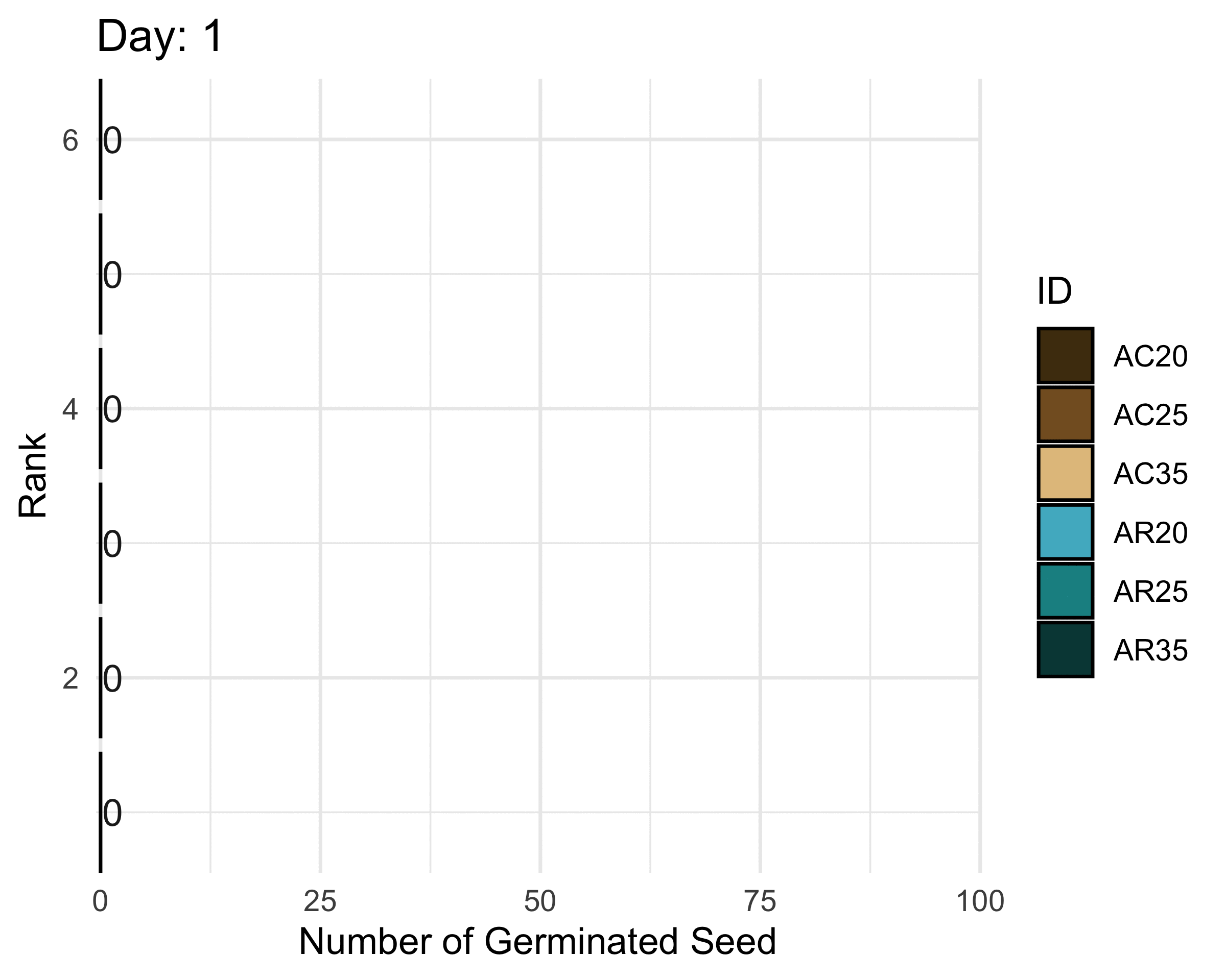
Dashboards
Live dashboards for interactive and real-time data exploration.
For the best experience, open the dashboard in a new tab:
👉 Launch Full Dashboard
👉 Explore Dashboard Collection
Let’s Collaborate
Interested in working together on a project or hosting a workshop?
Schedule a quick discovery call and let’s connect!